Scatter Plots
Scatter plots are ideal for exploring relationships between variables, identifying patterns, clusters, and outliers. Rekha’s scatter plots support multiple encoding channels (color, size, shape) to visualize multi-dimensional data effectively.
Basic Usage
import rekha as rk
import pandas as pd

# Simple scatter plot
df = pd.DataFrame({
    'height': [165, 170, 175, 180, 185],
    'weight': [60, 65, 70, 75, 80]
})

fig = rk.scatter(df, x='height', y='weight', title='Height vs Weight')
fig.show()
Examples Gallery
Basic Scatter Plot
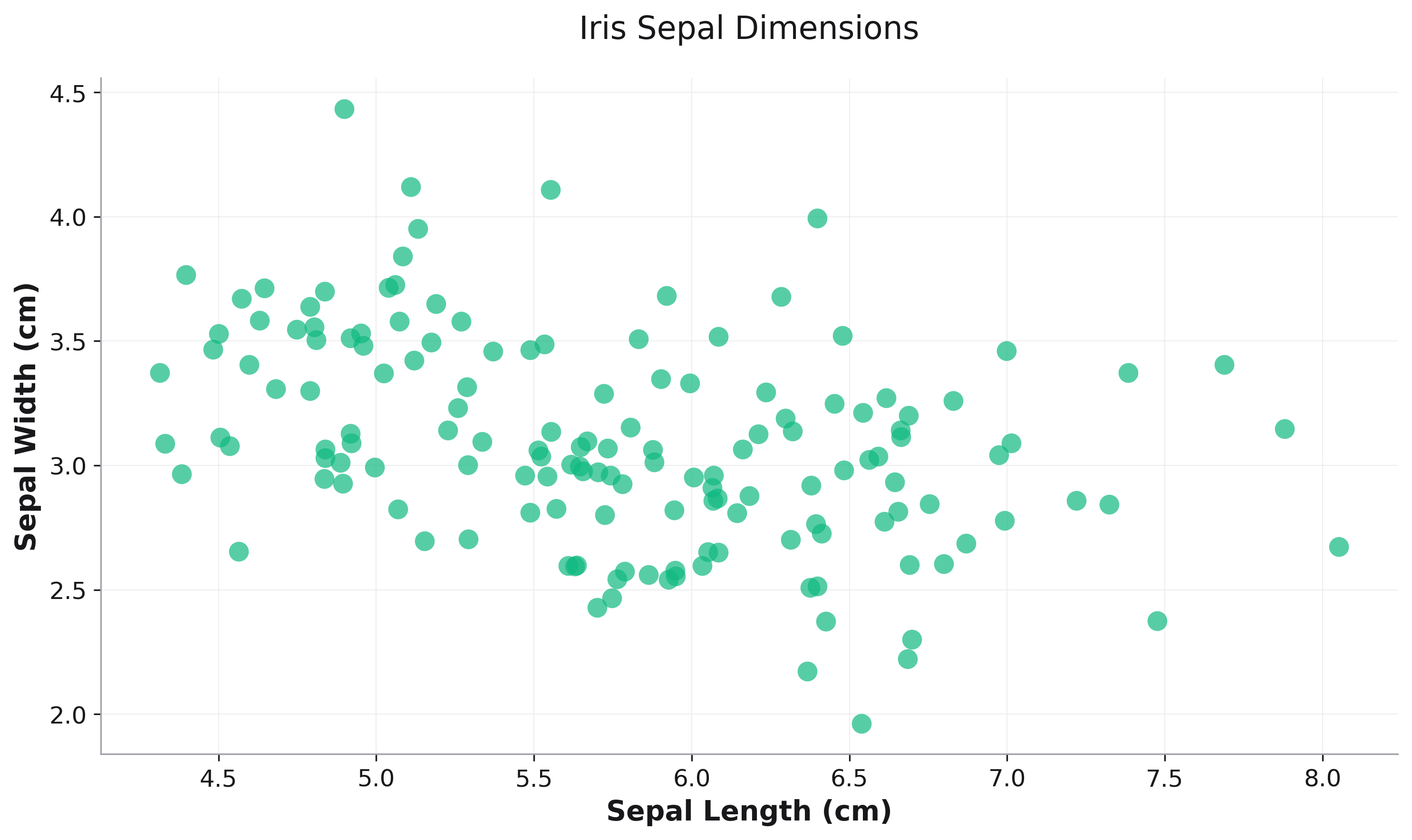
Simple relationship visualization:
import rekha as rk
from examples.utils import get_iris

df = get_iris()
fig = rk.scatter(
    data=df,
    x='sepal_length',
    y='sepal_width',
    title='Iris Sepal Dimensions',
    labels={
        'sepal_length': 'Sepal Length (cm)',
        'sepal_width': 'Sepal Width (cm)'
    }
)
Color-Encoded Categories
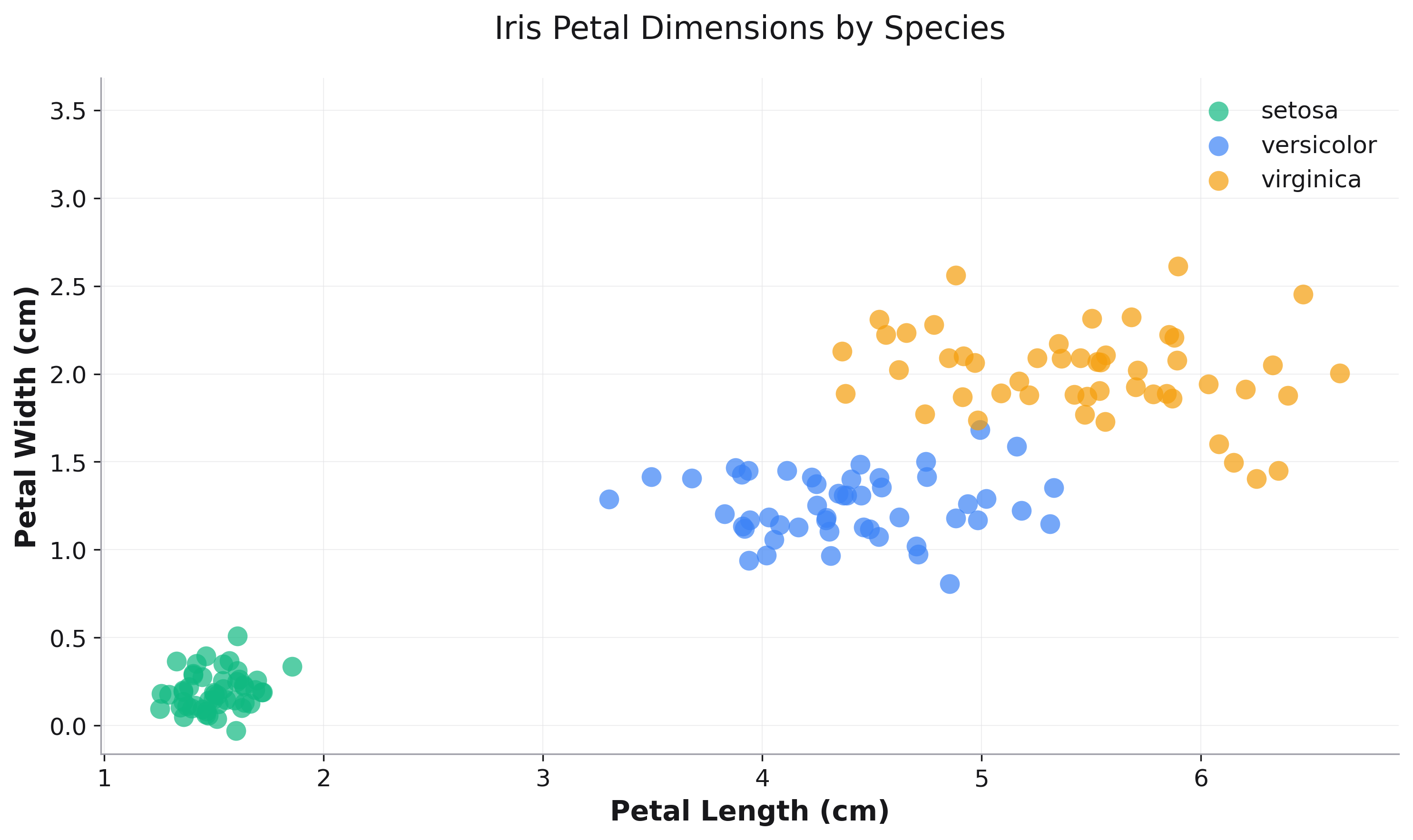
Use color to distinguish categories:
fig = rk.scatter(
    data=df,
    x='petal_length',
    y='petal_width',
    color='species',
    title='Iris Petal Dimensions by Species',
    labels={
        'petal_length': 'Petal Length (cm)',
        'petal_width': 'Petal Width (cm)',
        'species': 'Species'
    }
)
Multi-Feature Encoding
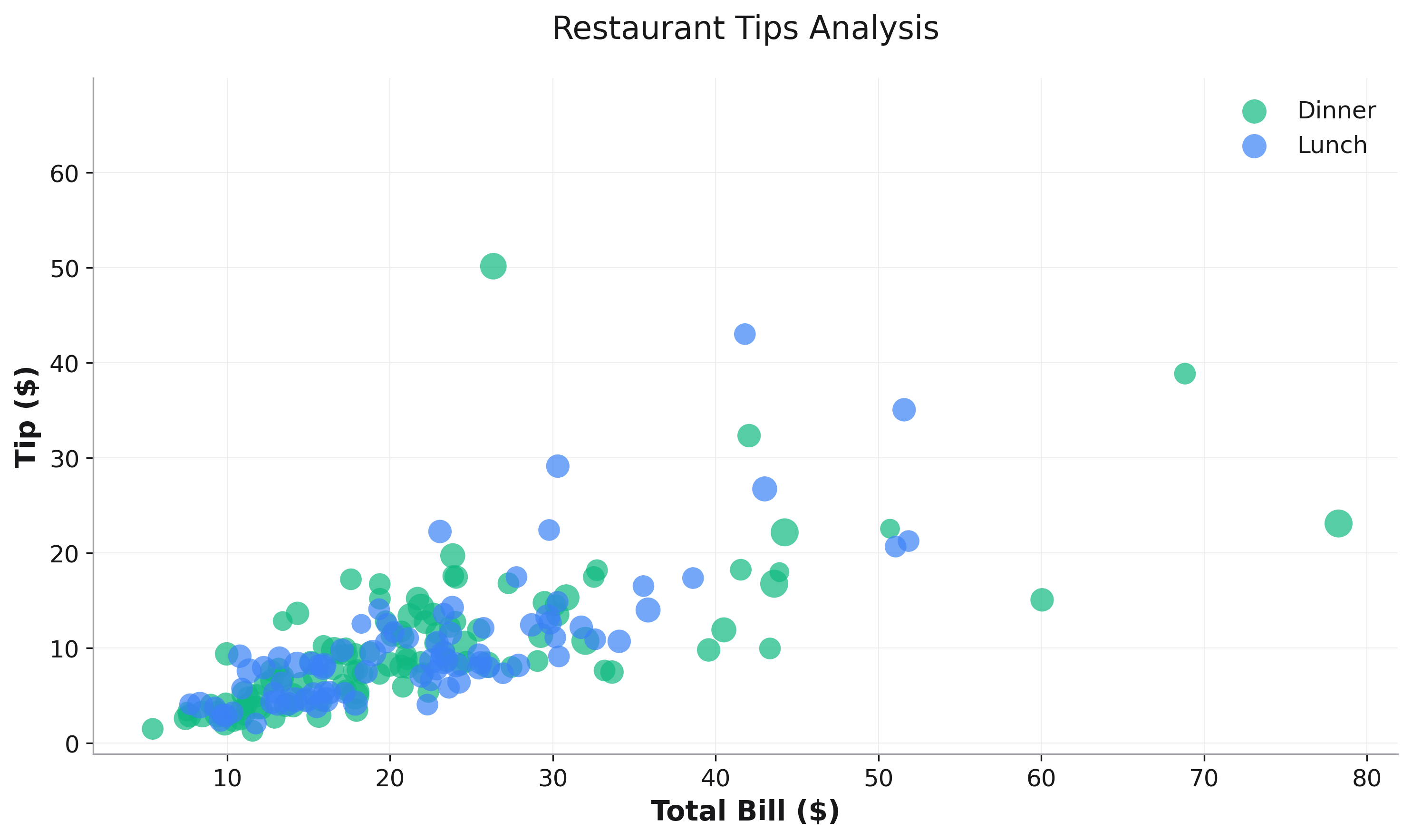
Combine color, size, and shape for complex visualizations:
fig = rk.scatter(
    data=df_tips,
    x='total_bill',
    y='tip',
    size='size',    # Party size
    color='time',   # Lunch vs Dinner
    title='Restaurant Tips Analysis',
    labels={
        'total_bill': 'Total Bill ($)',
        'tip': 'Tip ($)',
        'size': 'Party Size',
        'time': 'Meal Time'
    },
    alpha=0.7
)
Parameters
See the API Reference for complete parameter documentation.
See Also
Line Plots - For continuous trends over time
Histograms - For distribution analysis
API Reference - Complete parameter documentation