Facet Grids
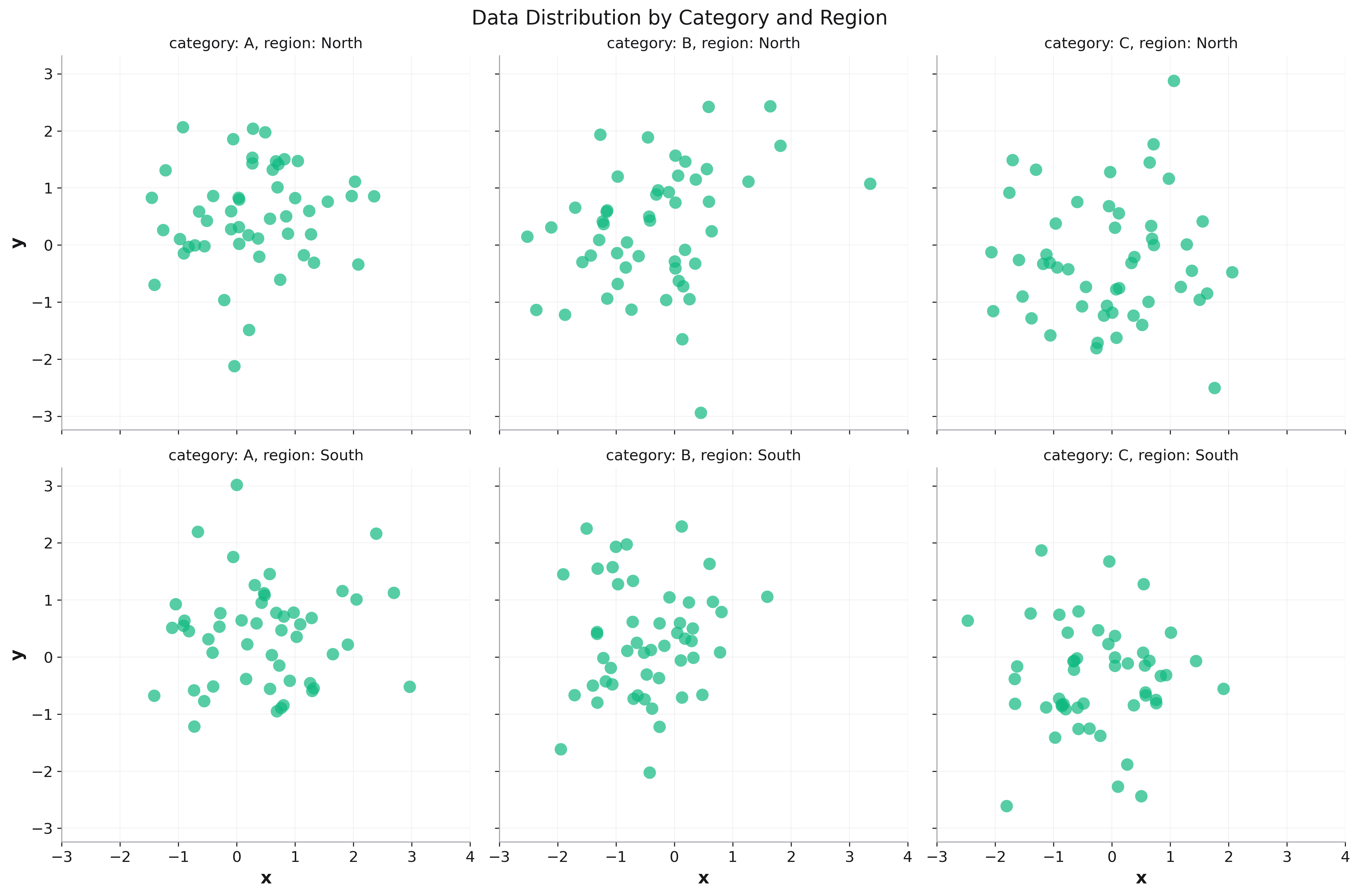
Facet grids are powerful tools for creating small multiples - a series of similar plots that show different subsets of your data. This technique, also known as trellis charts or panel plots, allows you to explore how patterns vary across different categories.
Rekha provides native faceting support directly in all plot functions using facet_row and facet_col parameters, exactly like Plotly Express. This approach is simpler and more intuitive than separate facet grid functions.
import rekha as rk
import pandas as pd
import numpy as np

# Create sample data
df = pd.DataFrame({
    'time': pd.date_range('2023-01-01', periods=100, freq='D'),
    'value': np.random.randn(100).cumsum(),
    'category': np.random.choice(['A', 'B', 'C'], 100),
    'region': np.random.choice(['North', 'South'], 100)
})

# Create faceted scatter plot - Native API
fig = rk.scatter(df, x='time', y='value',
                 facet_col='category',
                 title='Faceted Scatter Plot')
fig.show()
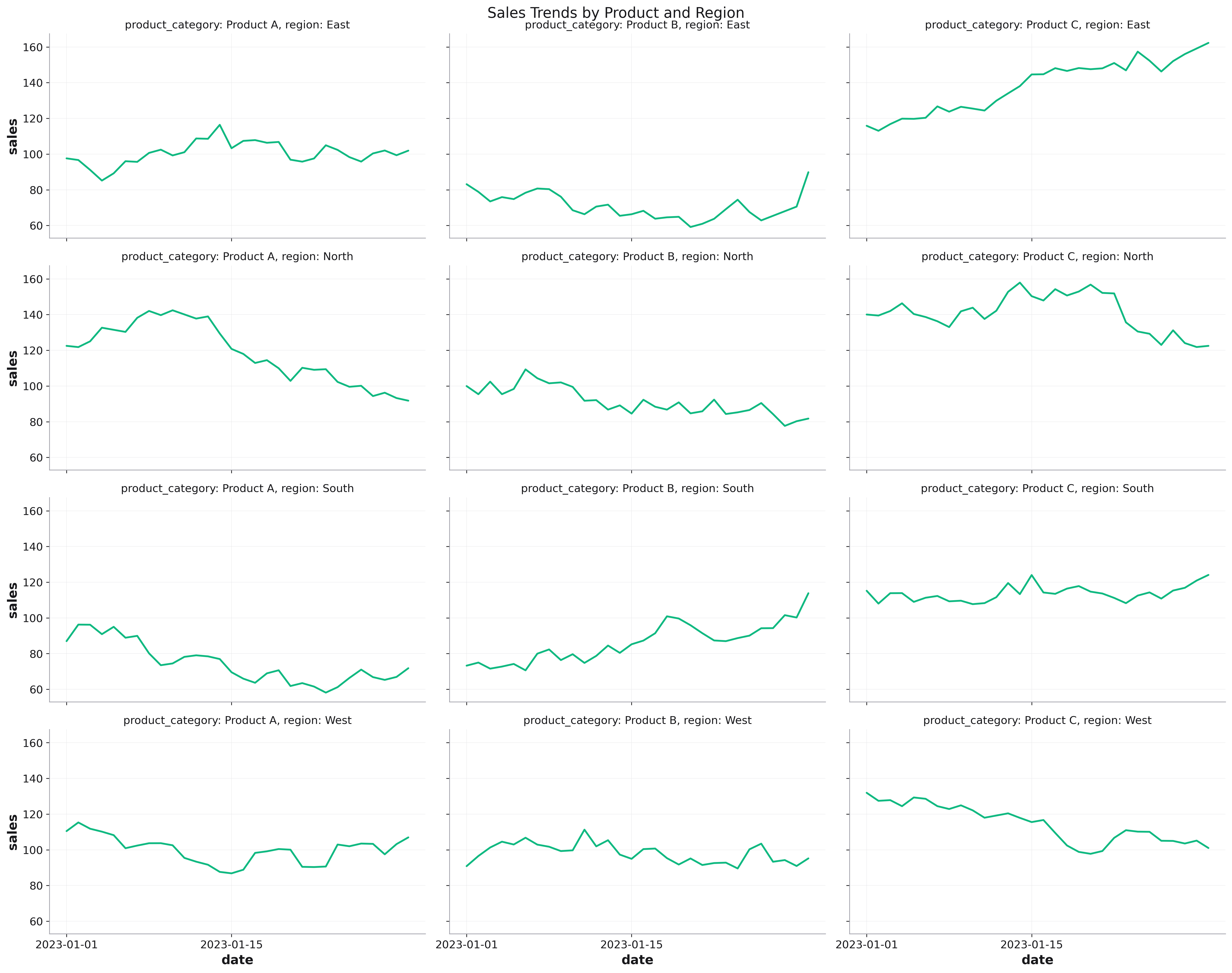
Time Series
# Create faceted time series
fig = rk.line(sales_df, x='date', y='sales',
              color='channel',  # Color by sales channel
              facet_col='product_category',
              facet_row='region',
              col_wrap=3,
              figsize=(15, 12),
              share_y=False,  # Different scales per product
              dark_mode=True,
              title='Sales by Product Category and Region')

# Add trend lines to each facet
for ax in fig.get_axes():
    # Add custom analysis per subplot
    ax.axhline(y=ax.get_ylim()[1] * 0.8,
               color='red', linestyle='--', alpha=0.5,
               label='Target')
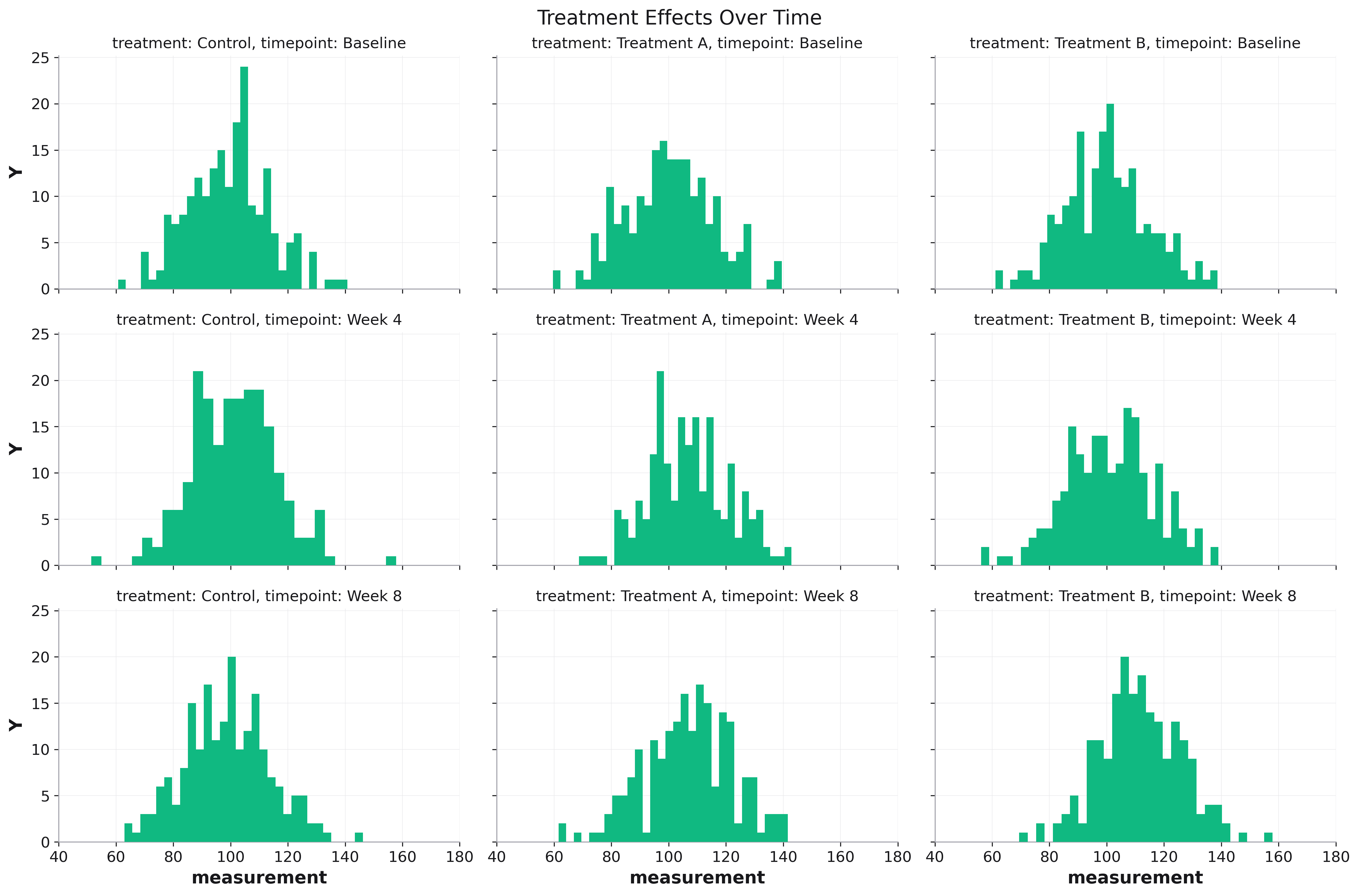
Distribution Analysis
# Experimental results
fig = rk.histogram(experiment_df, x='measurement',
                   facet_col='treatment',
                   facet_row='timepoint',
                   bins=30,
                   alpha=0.7,
                   share_x=True,  # Same scale for comparison
                   figsize=(12, 8),
                   title='Measurement Distribution by Treatment and Time')

# Add reference line to each subplot
for ax in fig.get_axes():
    ax.axvline(x=control_mean, color='red',
               linestyle='--', label='Control')
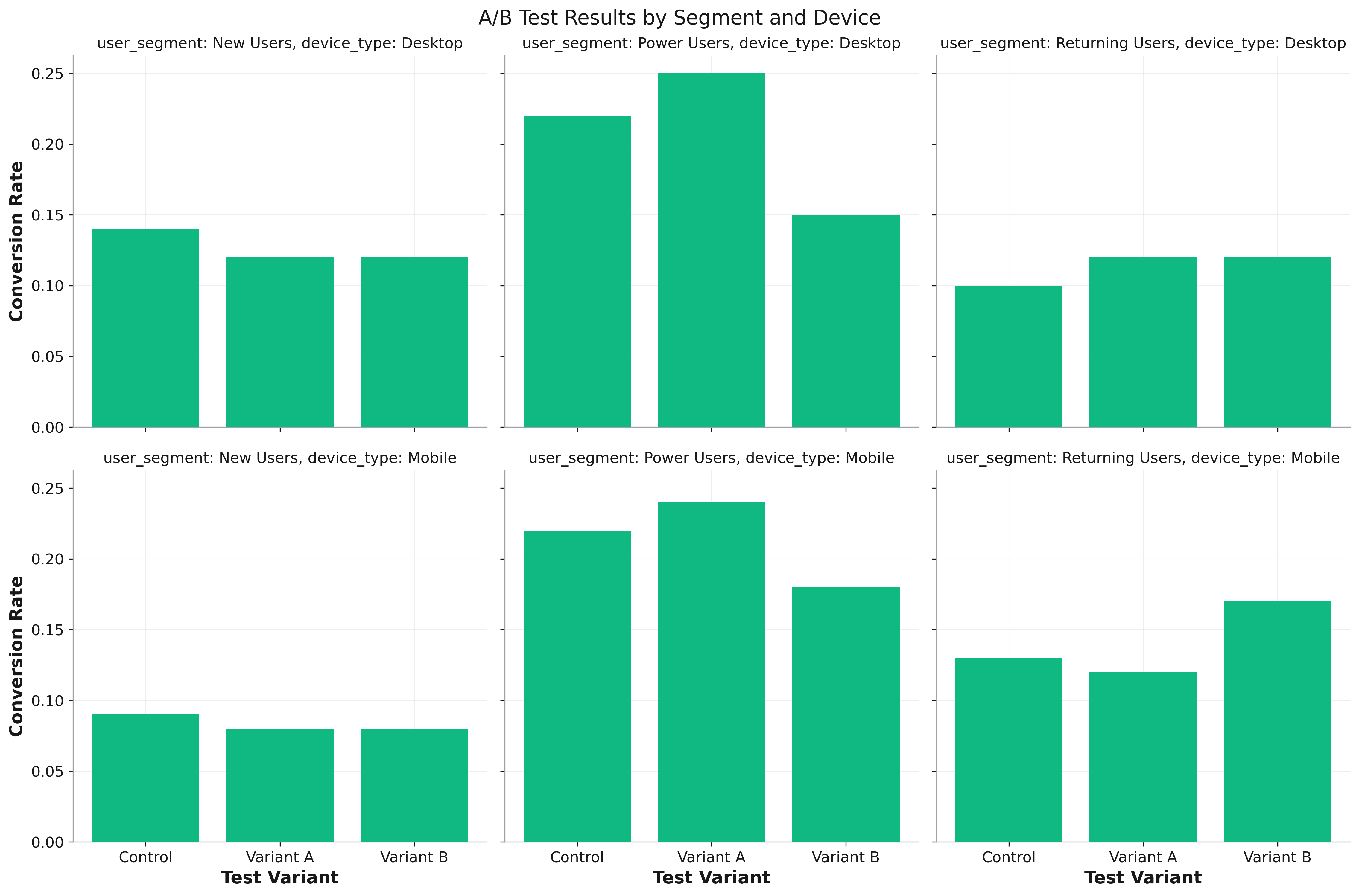
A/B Testing
fig = rk.bar(ab_test_df, x='variant', y='conversion_rate',
             facet_col='user_segment',
             facet_row='device_type',
             title='A/B Test Results by Segment and Device')
Geographic Analysis
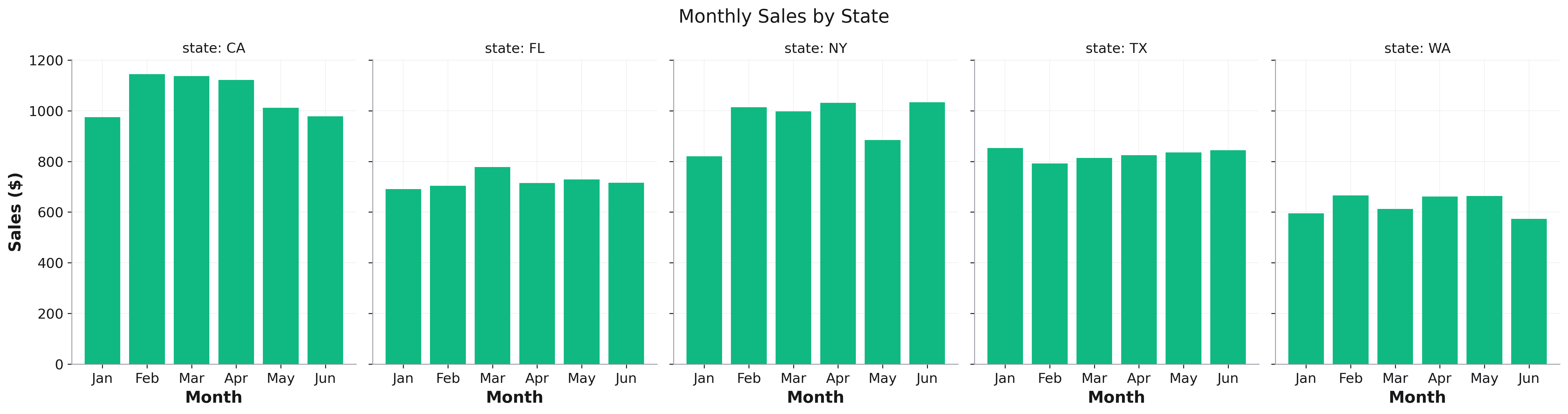
fig = rk.bar(geo_df, x='month', y='sales',
             facet_col='state',
             title='Monthly Sales by State')
Model Comparison
fig = rk.line(model_results, x='epoch', y='loss',
              color='metric_type',
              facet_col='model_architecture',
              facet_row='dataset',
              share_y=False,
              title='Model Training Loss Comparison')
Parameters
facet_col,facet_row: Column names for creating subplotsshare_x,share_y: Whether to share axis ranges (default: True)subplot_titles: Show automatic subplot titles (default: True)col_wrap,row_wrap: Wrap facets after N columns/rowssubplot_spacing: Space between subplots (default: 0.3)margin_spacing: Margin around entire grid (default: 0.1)
Note: Keep facet grids under 20 subplots for optimal performance.