Quick Start Guide
Get up and running with Rekha in 5 minutes. Rekha gives you Plotly Express simplicity with matplotlib’s publication-quality output.
Installation
pip install rekha
Your First Plot
import rekha as rk
import pandas as pd
import numpy as np

# Create compelling sample data - stock market performance
np.random.seed(42)
dates = pd.date_range('2023-01-01', periods=100, freq='D')
stocks = ['AAPL', 'GOOGL', 'MSFT', 'AMZN']

data = []
for stock in stocks:
    base_price = np.random.uniform(100, 200)
    trend = np.random.uniform(0.1, 0.5)
    volatility = np.random.uniform(5, 15)
    prices = base_price + np.cumsum(np.random.randn(100) * volatility + trend)

    for date, price in zip(dates, prices):
        data.append({'date': date, 'stock': stock, 'price': price})

df = pd.DataFrame(data)

# One line creates a professional visualization
fig = rk.line(df, x='date', y='price', color='stock',
              title='Tech Stock Performance - Q1 2023',
              labels={'price': 'Stock Price ($)', 'date': 'Date'})
fig.show()
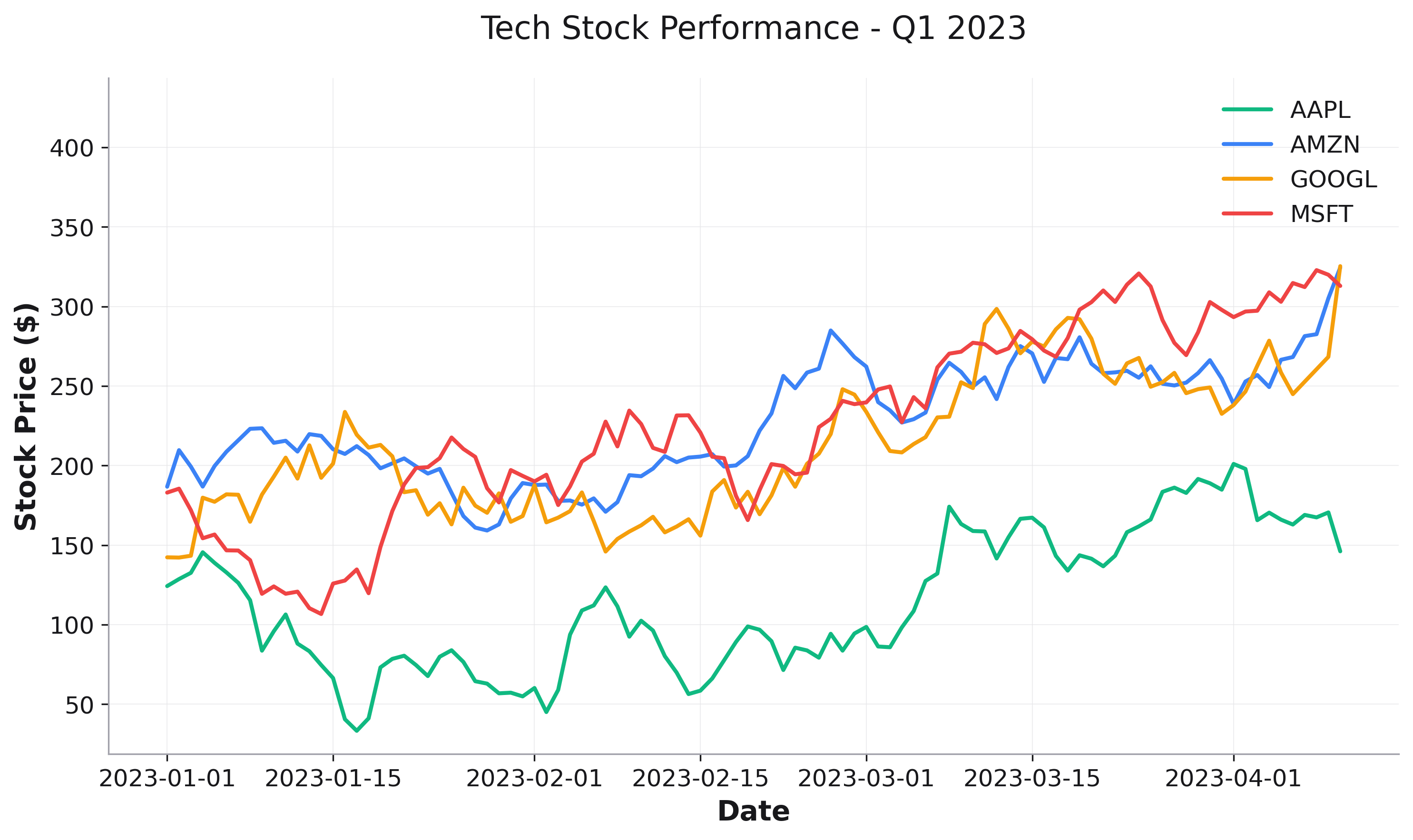
Why Rekha? Notice how simple that was - just specify your data columns and get a beautiful plot. No matplotlib boilerplate, no manual color cycling, no styling needed.
Core Plot Types
Statistical Visualizations:
# Distribution analysis
fig = rk.histogram(df, x='values', title='Distribution')

# Correlation analysis
fig = rk.heatmap(correlation_matrix, title='Correlations')

# Comparative analysis
fig = rk.box(df, x='category', y='metric', title='Comparison')
Publication Quality:
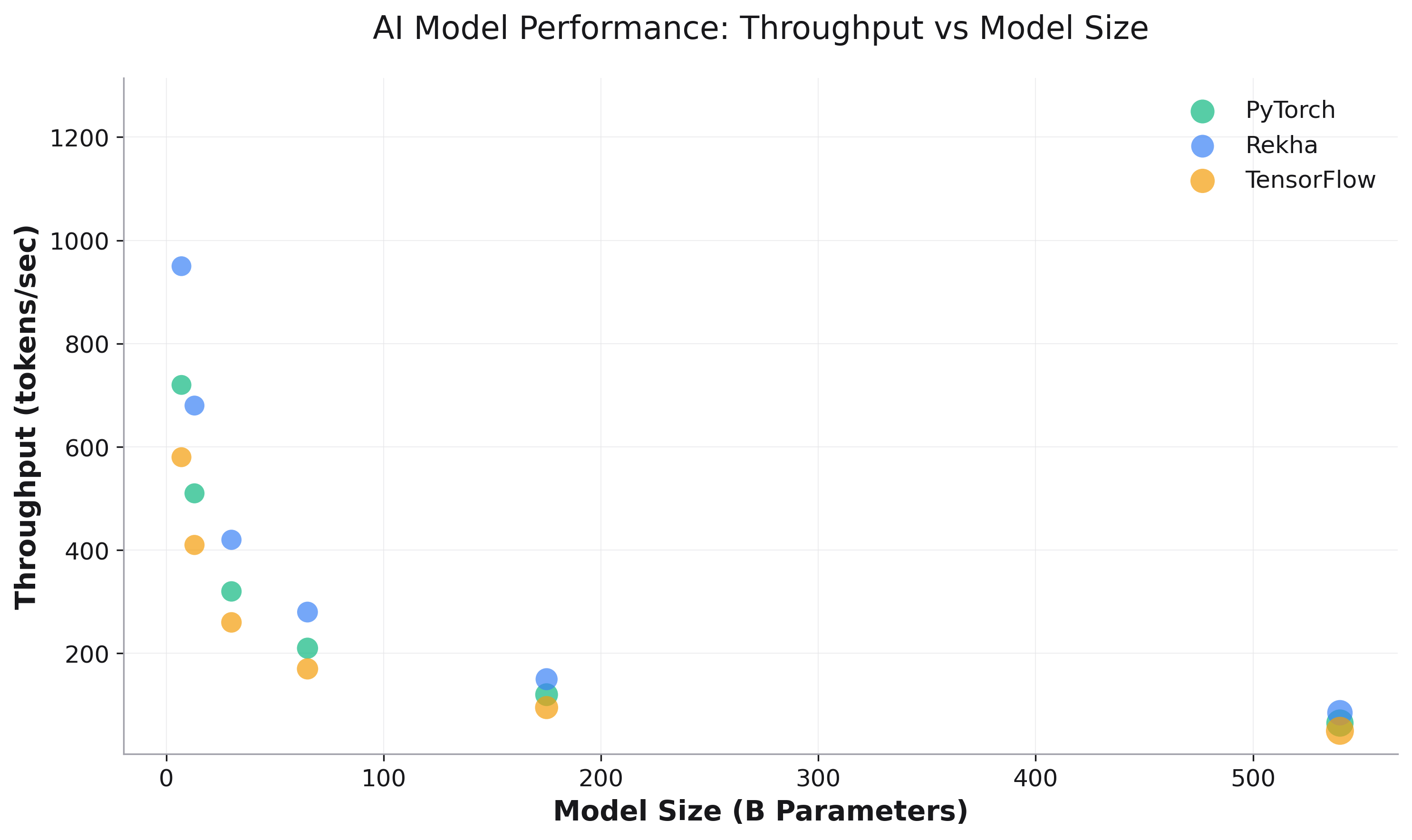
# Multi-dimensional analysis
fig = rk.scatter(df, x='cpu', y='memory',
                 color='framework', size='throughput',
                 title='Performance Analysis')
Modern Features
Dark Mode & Themes:
# Modern dark theme
fig = rk.line(df, x='x', y='y', dark_mode=True)

# Print-optimized
fig = rk.scatter(df, x='x', y='y', grayscale_friendly=True)
Smart Export:
# Optimized for different use cases
fig.save('chart.png', format='social')        # Social media
fig.save('figure.pdf', format='paper')        # Publications
fig.save('slide.png', format='presentation')  # Presentations
Matplotlib Integration:
# Full matplotlib compatibility
fig = rk.scatter(df, x='x', y='y', title='Customizable')

# Access matplotlib axes for advanced customization
ax = fig.get_axes()[0]
ax.annotate('Important!', xy=(5, 0.8), fontsize=12)
Next Steps
Plot Types - Detailed guides for each plot type
Advanced Features - Advanced features and customization
API Reference - Complete API reference
Start plotting with the power of matplotlib and simplicity of Plotly Express! 🎨📊