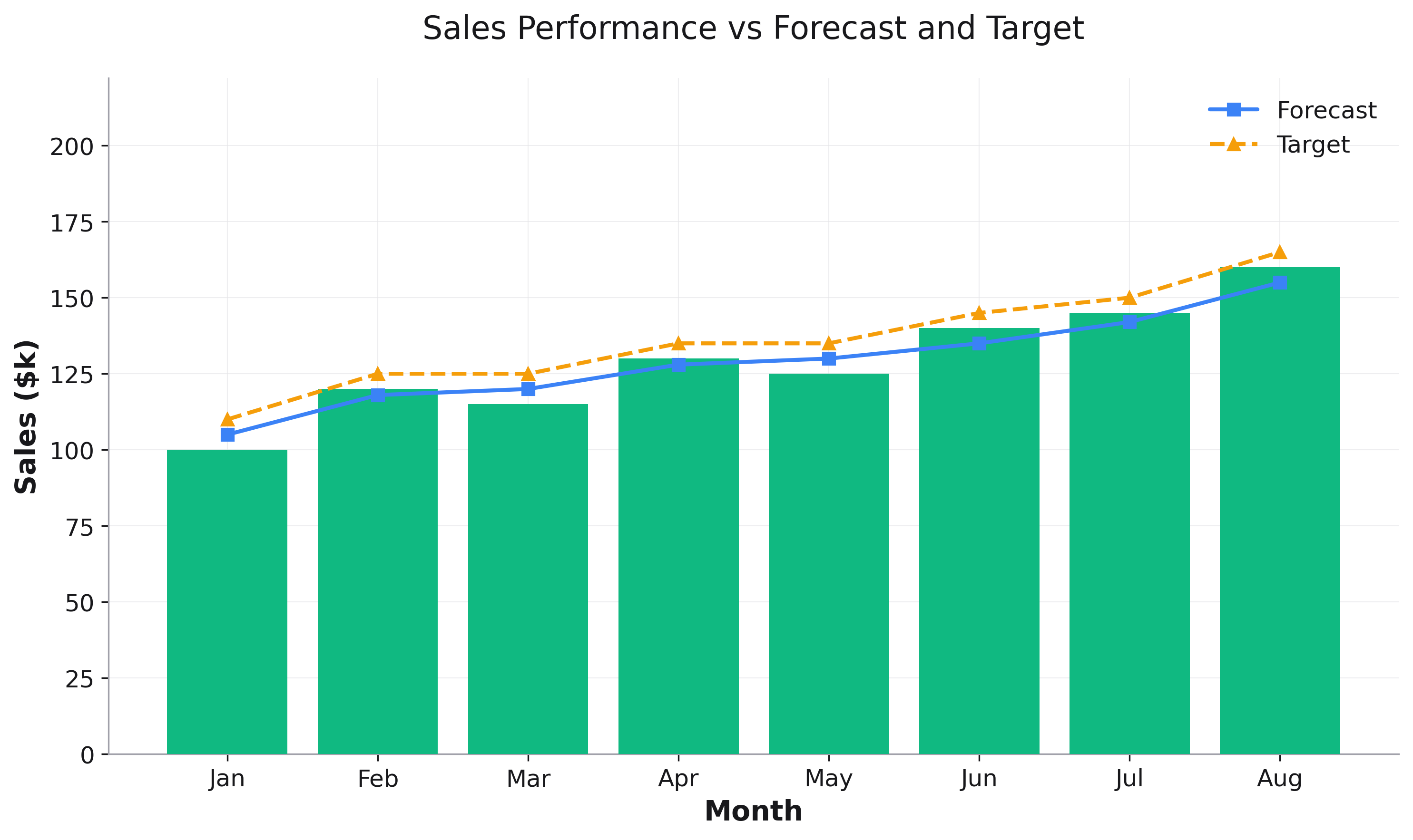
Plot Composition
Layer multiple plot types using the base_plot parameter.
import rekha as rk
import pandas as pd

# Create sample data
df = pd.DataFrame({
    'month': ['Jan', 'Feb', 'Mar', 'Apr', 'May', 'Jun'],
    'actual': [100, 120, 115, 130, 125, 140],
    'forecast': [105, 118, 120, 128, 130, 135]
})

# Create base bar plot
bar_plot = rk.bar(df, x='month', y='actual',
                  title='Sales Performance',
                  labels={'month': 'Month', 'actual': 'Sales ($k)'})

# Add line plot on top
line_plot = rk.line(df, x='month', y='forecast',
                    base_plot=bar_plot,  # Add to existing plot
                    markers=True,
                    label='Forecast')

# Update legend to show both
line_plot.ax.legend()
line_plot.show()
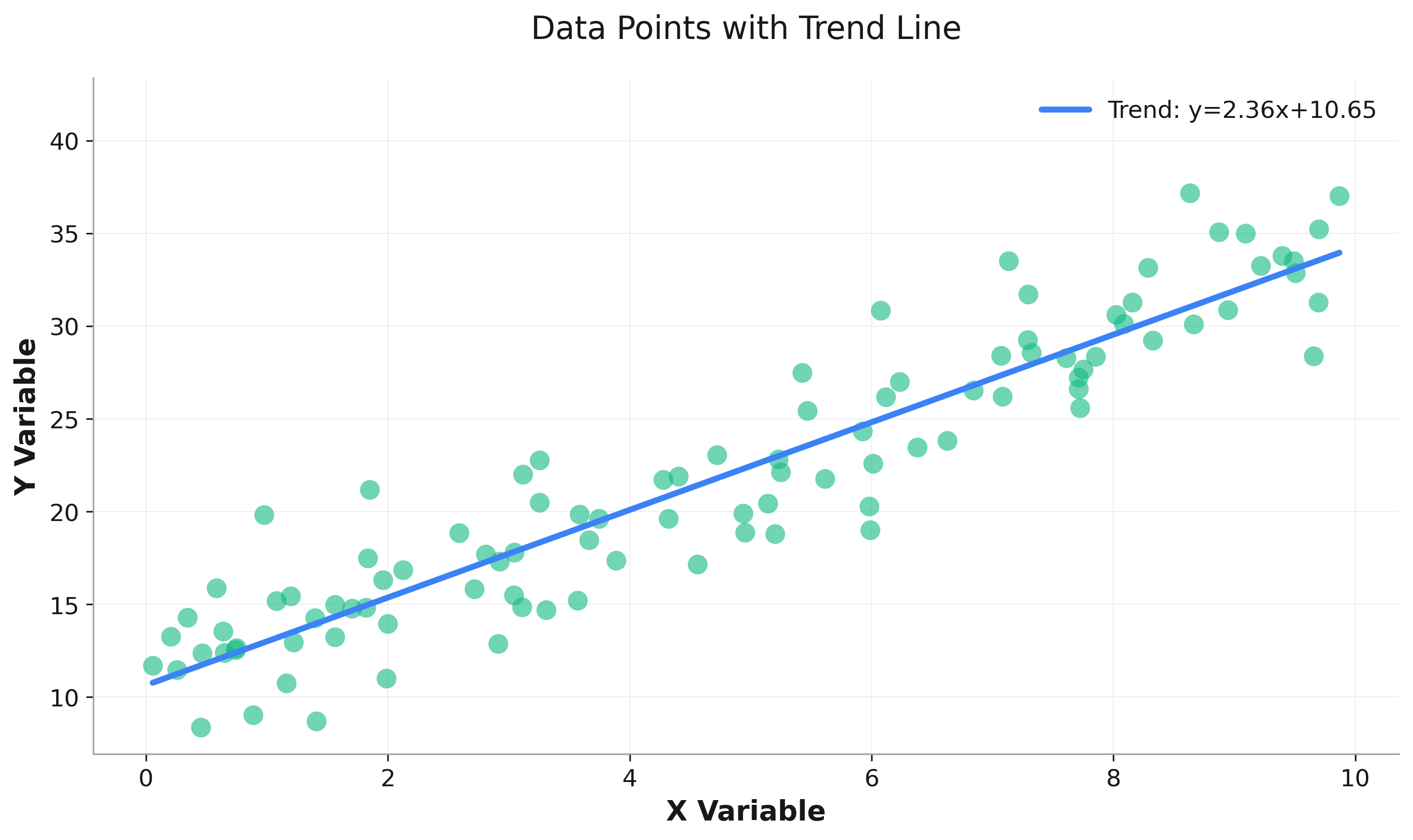
Scatter with Trend Line
# Create scatter plot
scatter_plot = rk.scatter(df, x='x', y='y',
                          title='Data with Trend Line',
                          alpha=0.6)

# Calculate trend line
z = np.polyfit(df['x'], df['y'], 1)
trend_x = [df['x'].min(), df['x'].max()]
trend_y = [z[0] * x + z[1] for x in trend_x]

# Add trend line
trend_df = pd.DataFrame({'x': trend_x, 'y': trend_y})
line_plot = rk.line(trend_df, x='x', y='y',
                    base_plot=scatter_plot,
                    color='red',
                    line_width=3,
                    label=f'y={z[0]:.2f}x+{z[1]:.2f}')

line_plot.ax.legend()
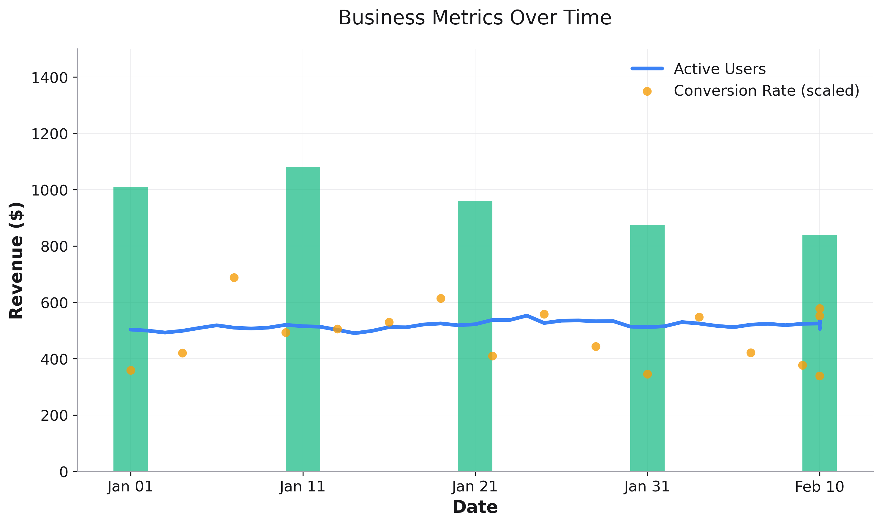
Multi-Series Composition
# Generate time series data
dates = pd.date_range('2023-01-01', periods=50, freq='D')
df = pd.DataFrame({
    'date': dates,
    'revenue': 1000 + np.cumsum(np.random.randn(50) * 20),
    'users': 500 + np.cumsum(np.random.randn(50) * 10),
    'conversion_rate': 0.1 + np.random.randn(50) * 0.02
})

# Sample every 10 days for bar chart and format dates
df_bars = df[::10].copy()
df_bars['date_str'] = df_bars['date'].dt.strftime('%b %d')

# Create base bar plot with categorical x-axis
bar_plot = rk.bar(df_bars, x='date_str', y='revenue',
                  title='Business Metrics Over Time',
                  labels={'date_str': 'Date', 'revenue': 'Revenue ($)'},
                  alpha=0.7,
                  bar_width=0.4)

# Map continuous dates to bar positions for overlay plots
bar_dates = df_bars['date'].values
df['x_pos'] = np.interp(df['date'].astype(np.int64),
                       bar_dates.astype(np.int64),
                       np.arange(len(bar_dates)))

# Add line for user count
line_plot = rk.line(df, x='x_pos', y='users',
                    base_plot=bar_plot,
                    color='green',
                    line_width=3,
                    label='Active Users')

# Add scatter for conversion rate (scaled to match revenue range)
df['conversion_scaled'] = df['conversion_rate'] * 5000
scatter_plot = rk.scatter(df[::3], x='x_pos', y='conversion_scaled',
                          base_plot=line_plot,
                          point_size=50,
                          alpha=0.8,
                          label='Conversion Rate (scaled)')

# Show legend with all series
scatter_plot.ax.legend()
All Rekha plot types support composition except heatmaps (which fill the entire axes).
How It Works
The base_plot parameter:
Uses the same figure and axes from the base plot
Automatically cycles colors for each new layer
Preserves theme settings (dark mode, fonts, etc.)
Cannot be used with faceted plots