Matplotlib Customization
Access matplotlib’s full power while keeping Rekha’s beautiful defaults.
Basic Access
import rekha as rk
import matplotlib.pyplot as plt
# Create Rekha plot
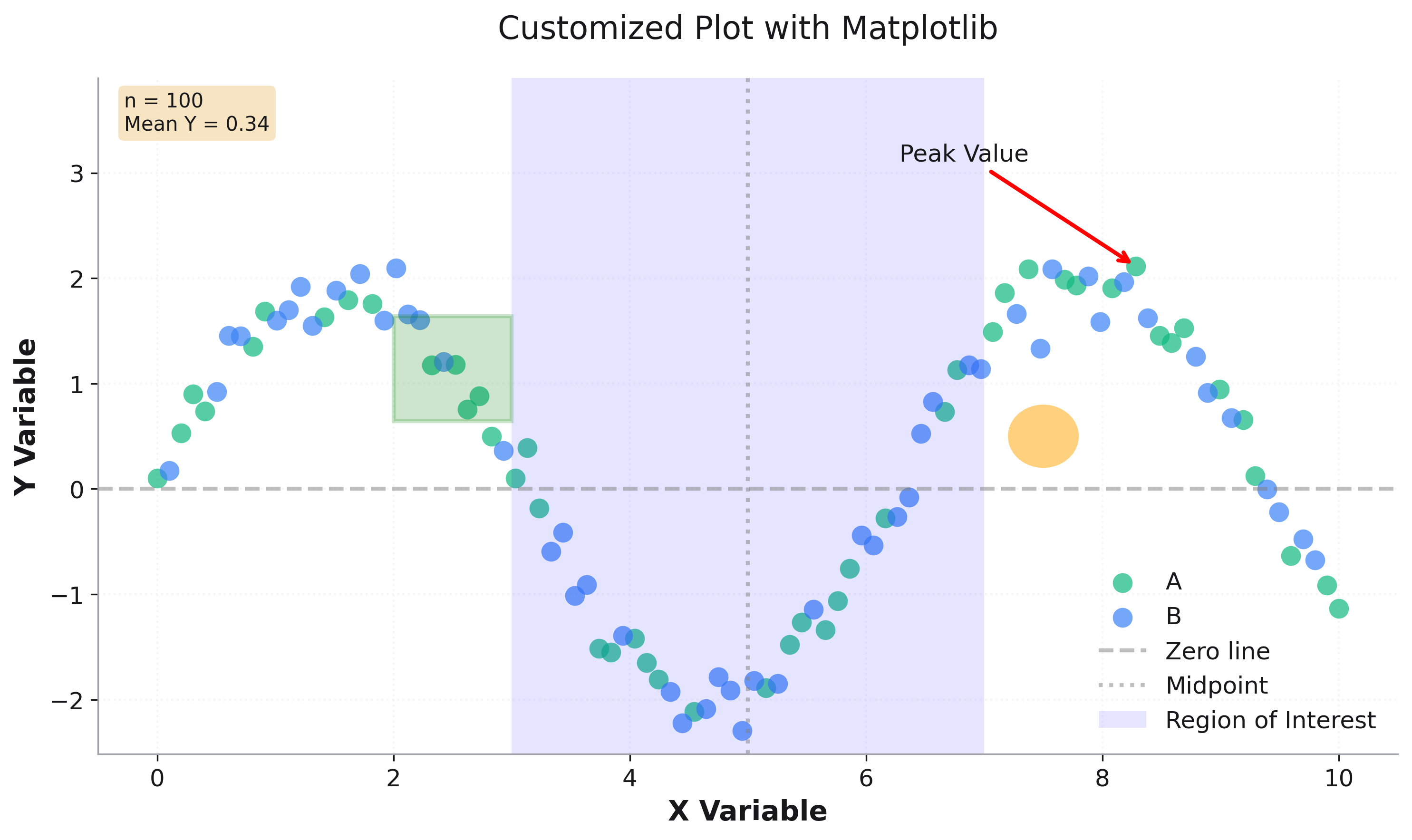
fig = rk.scatter(df, x='x', y='y', color='category',
title='Customized Plot')
# Access matplotlib axes
ax = fig.get_axes()[0]
# Add annotations
ax.annotate('Peak Value',
xy=(peak_x, peak_y),
xytext=(peak_x - 2, peak_y + 1),
arrowprops=dict(arrowstyle='->', color='red'))
# Add reference lines
ax.axhline(y=0, color='gray', linestyle='--', alpha=0.5)
ax.axvline(x=5, color='gray', linestyle=':', alpha=0.5)
# Add shaded region
ax.axvspan(3, 7, alpha=0.1, color='lightblue')
# Update legend
ax.legend(loc='lower right')
Dual Axes
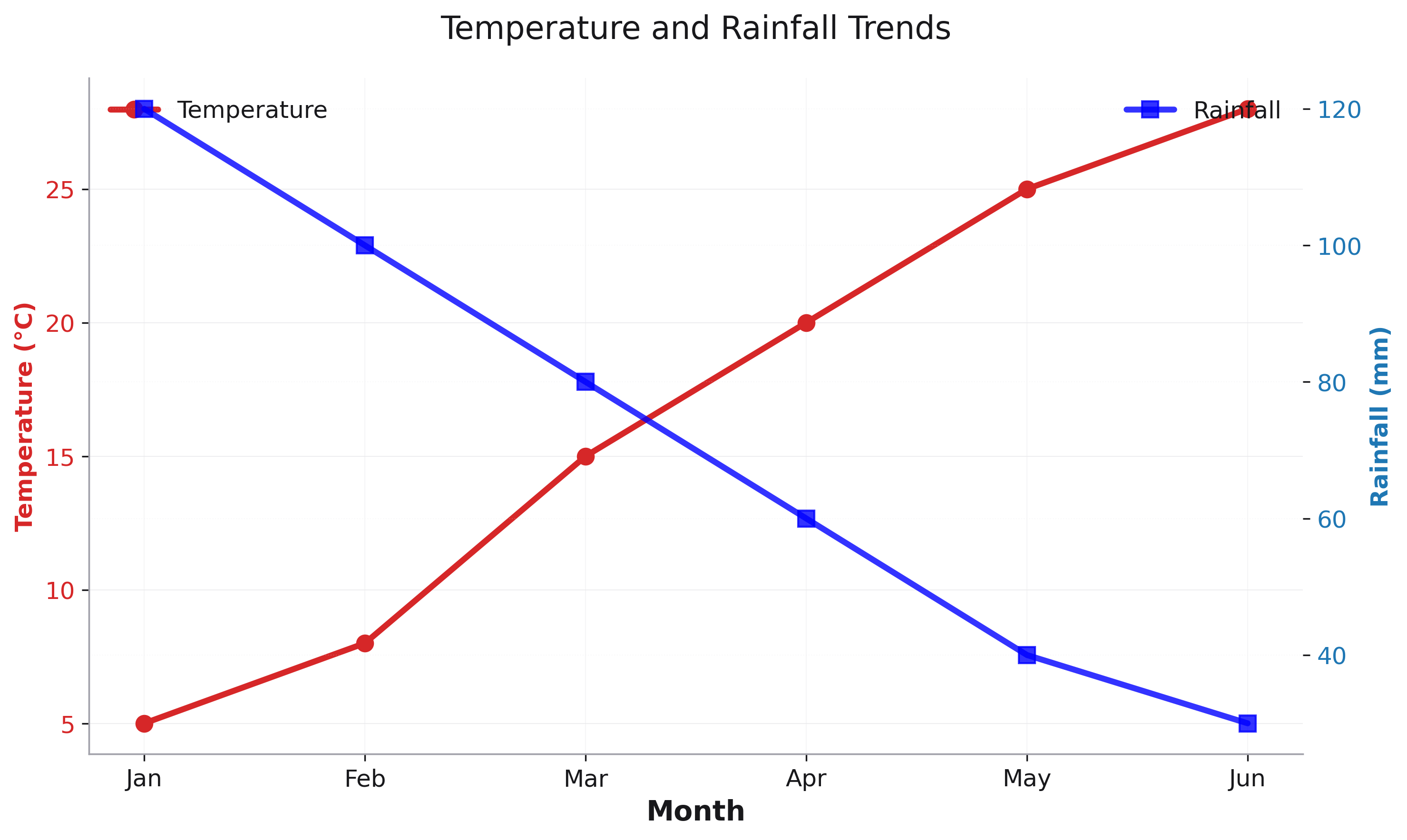
# Create primary plot
fig = rk.line(df, x='month', y='temperature',
              title='Temperature and Rainfall')
ax1 = fig.get_axes()[0]
ax1.set_ylabel('Temperature (°C)', color='tab:red')

# Create secondary y-axis
ax2 = ax1.twinx()
ax2.plot(df['month'], df['rainfall'], 'b-', label='Rainfall')
ax2.set_ylabel('Rainfall (mm)', color='tab:blue')
Custom Formatting
# Create plot
fig = rk.bar(df, x='quarter', y='revenue')
ax = fig.get_axes()[0]

# Format y-axis as currency
import matplotlib.ticker as mticker
ax.yaxis.set_major_formatter(
    mticker.FuncFormatter(lambda x, p: f'${x/1000:.0f}K'))

# Rotate x-axis labels
ax.set_xticklabels(ax.get_xticklabels(),
                   rotation=45, ha='right')
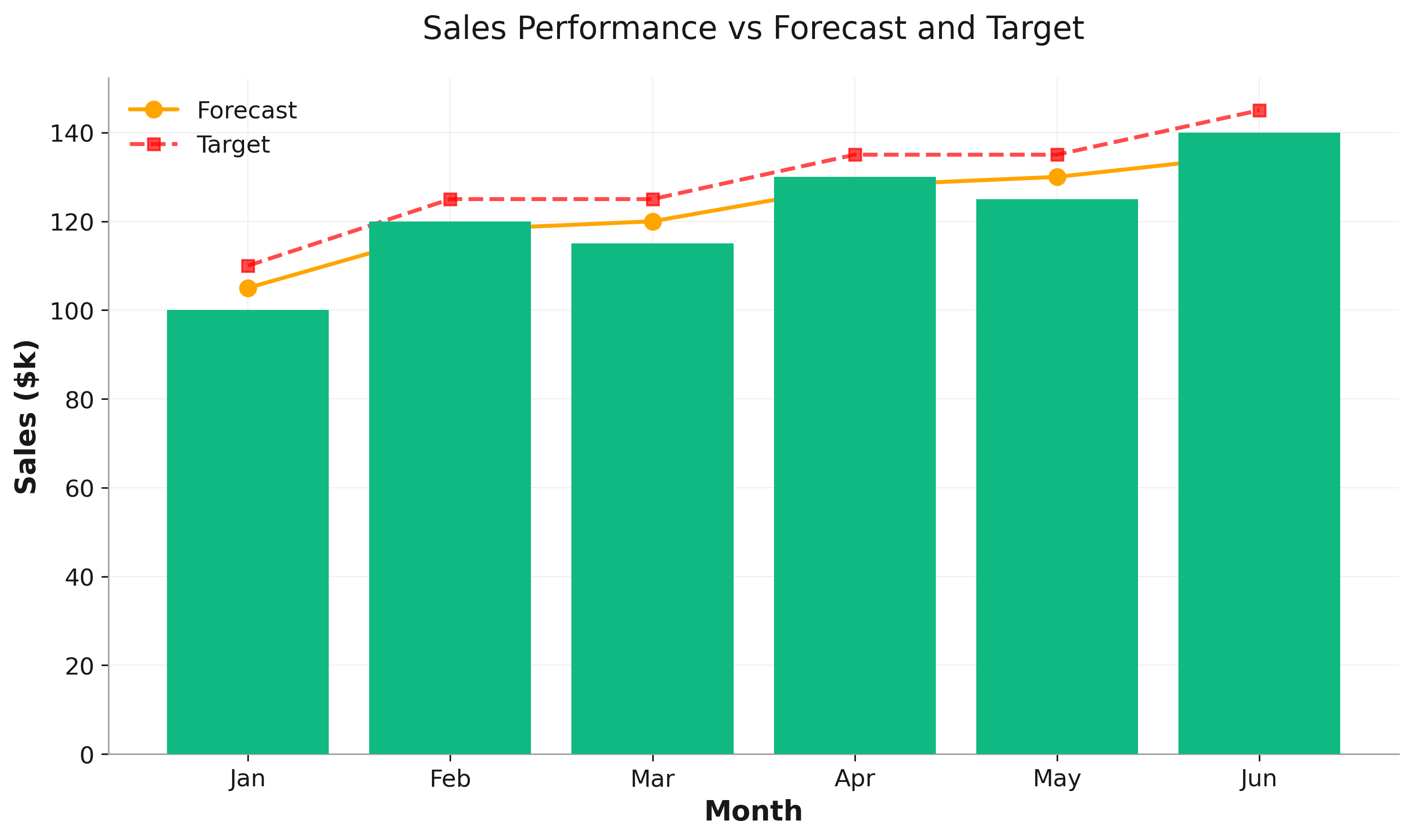
Combining Plot Types
# Create base bar plot
fig = rk.bar(df, x='month', y='actual',
             title='Sales Performance')
ax = fig.get_axes()[0]

# Add line plot overlay
ax.plot(df['month'], df['forecast'], 'o-',
        color='orange', linewidth=2, label='Forecast')

# Update legend
ax.legend()
Working with Themes
# Start with Rekha plot
fig = rk.line(df, x='x', y='y', dark_mode=True)
ax = fig.get_axes()[0]

# Get current theme colors
bg_color = fig.get_facecolor()
text_color = ax.xaxis.label.get_color()

# Add custom elements matching the theme
ax.text(0.5, 0.95, 'Custom Text',
        transform=ax.transAxes,
        color=text_color,
        fontsize=14)
Note: All standard matplotlib methods work with Rekha figures.