Axis Scales and Formatting
Transform how your data appears with logarithmic scales and human-readable number formatting.
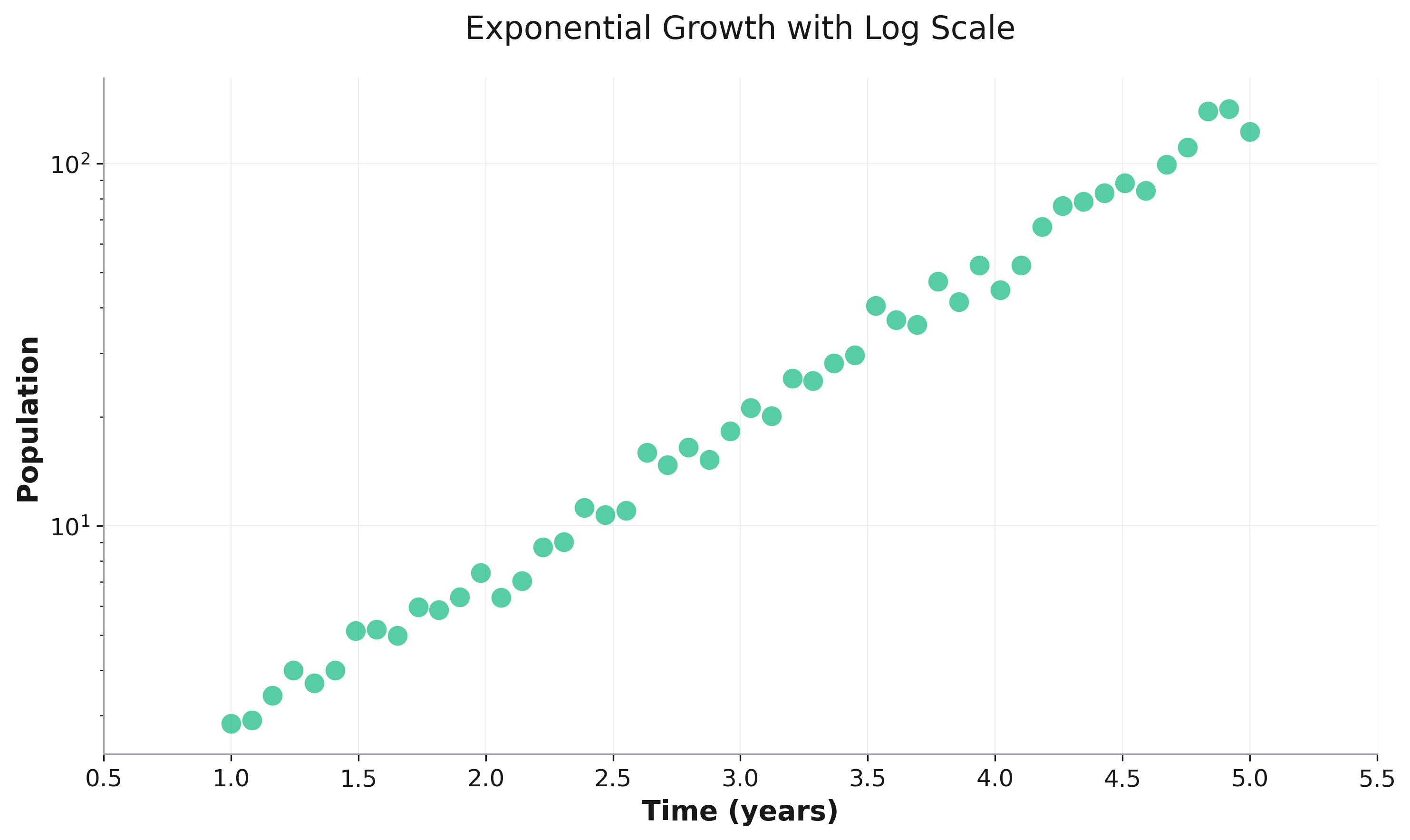
Logarithmic Scales
Use logarithmic scales for data that spans multiple orders of magnitude:
import rekha as rk
import pandas as pd
import numpy as np

# Generate exponential data
x = np.linspace(1, 5, 50)
y = np.exp(x) + np.random.normal(0, 10, 50)

df = pd.DataFrame({'x': x, 'y': y})

# Apply log scale to y-axis
fig = rk.scatter(df, x='x', y='y',
                 title='Exponential Growth',
                 yscale='log')
Scale Types
linear(default): Standard linear scalelog: Base-10 logarithmic scalesymlog: Symmetric log (handles negative values)logit: For probabilities (0 to 1)
# Log-log plot for power law relationships
fig = rk.scatter(df, x='size', y='frequency',
                 xscale='log',
                 yscale='log',
                 title='Power Law Distribution')

# Symmetric log for data with negative values
fig = rk.line(df, x='time', y='change',
              yscale='symlog',
              title='Rate of Change')

# Logit scale for probabilities
fig = rk.scatter(df, x='feature', y='probability',
                 yscale='logit',
                 title='Probability Distribution')
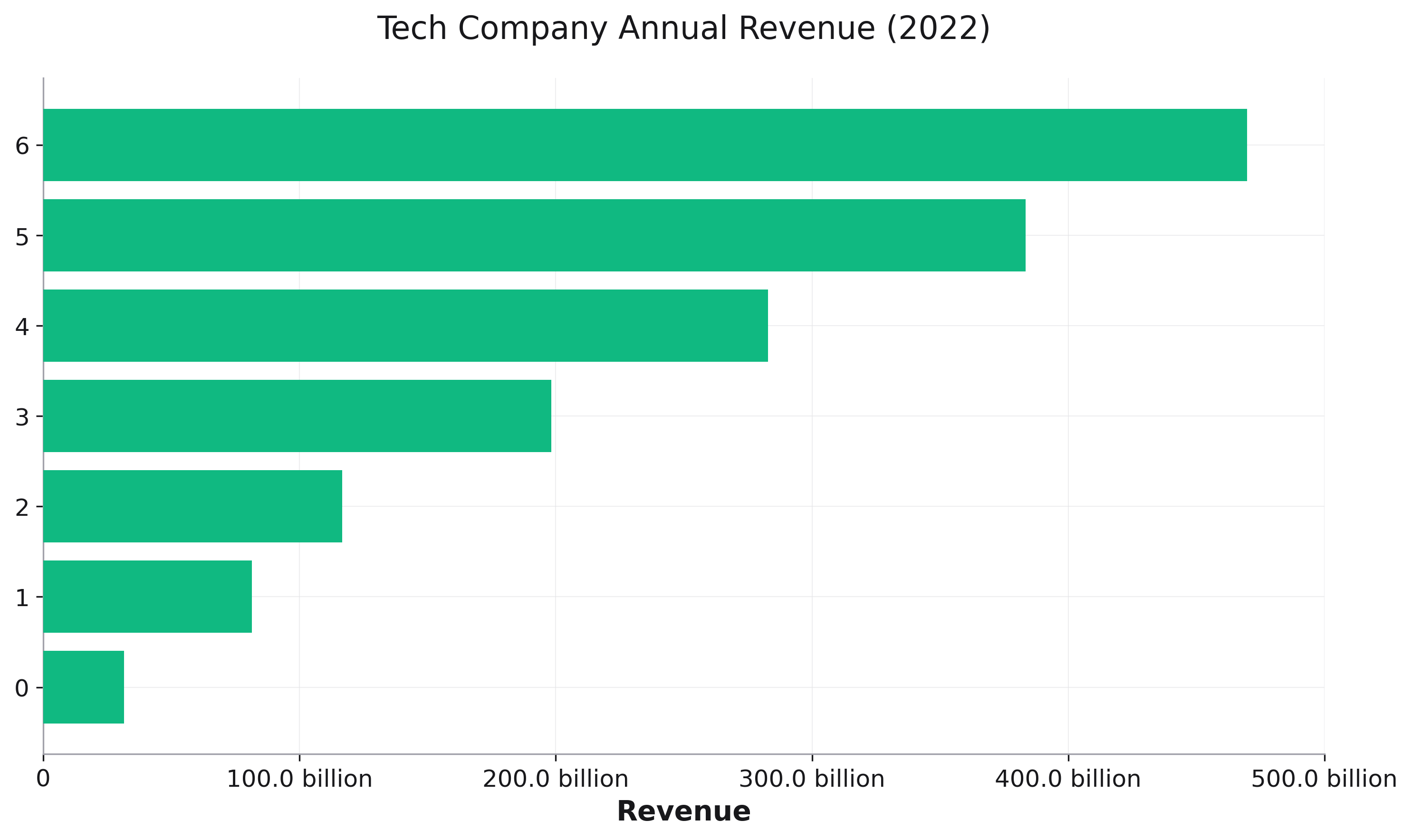
Human-Readable Number Formatting
Display large numbers in an easily readable format:
# Revenue data in billions
df = pd.DataFrame({
    'company': ['Apple', 'Microsoft', 'Google', 'Amazon', 'Meta'],
    'revenue': [383285000000, 198270000000, 282836000000, 469822000000, 116609000000]
})

# Enable humanized formatting
fig = rk.bar(df, x='company', y='revenue',
             title='Tech Company Revenue',
             humanize_units=True,
             humanize_format='intword')
Formatting Options
intword: “1M”, “2.5B”, “3.2T” (default)intcomma: “1,000,000”, “2,500,000”scientific: “1.0 × 10⁶”, “2.5 × 10⁶”fractional: “1/2”, “3/4”, “5/8”
Use Cases
# Financial data with comma separators
fig = rk.line(df, x='date', y='stock_price',
              humanize_units=True,
              humanize_format='intcomma',
              title='Stock Price Over Time')

# Scientific notation for very large/small numbers
fig = rk.scatter(df, x='mass', y='energy',
                 humanize_units=True,
                 humanize_format='scientific',
                 title='Mass-Energy Relationship')
Combining Scales and Formatting
Use both features together for maximum clarity:
# User growth over time (exponential with readable numbers)
fig = rk.line(df, x='year', y='users',
              title='Platform User Growth',
              yscale='log',           # Log scale for exponential growth
              humanize_units=True,    # Show as "1M", "100M", etc.
              labels={'year': 'Year', 'users': 'Active Users'})

# Scientific data with appropriate scaling
fig = rk.scatter(df, x='concentration', y='response',
                 xscale='log',
                 yscale='linear',
                 humanize_units=True,
                 humanize_format='scientific',
                 title='Dose-Response Curve')