Line Plots
Line plots are perfect for visualizing trends over time, continuous data relationships, and comparing multiple series.
Basic Usage
import rekha as rk
import pandas as pd

# Simple line plot
df = pd.DataFrame({
    'x': [1, 2, 3, 4, 5],
    'y': [2, 4, 3, 5, 6]
})

fig = rk.line(df, x='x', y='y', title='Simple Line Plot')
fig.show()
Examples Gallery
Multiple Series
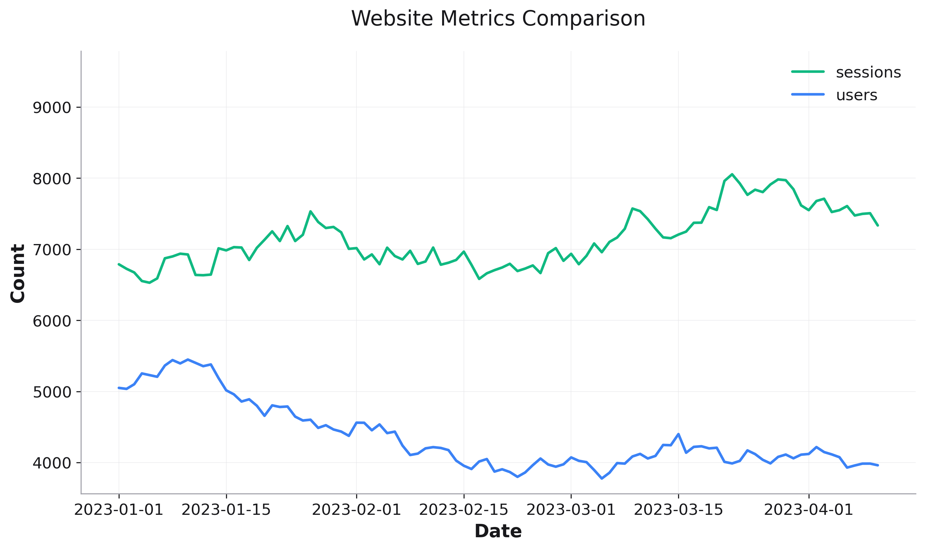
Compare multiple time series by using the color parameter:
# Time series comparison
fig = rk.line(df, x='date', y='value', color='metric',
              title='Performance Metrics Over Time')
With Markers
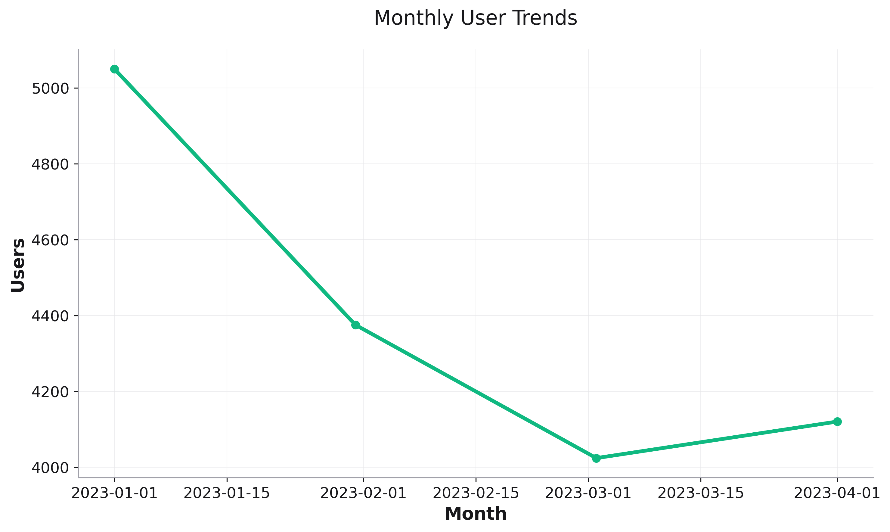
Add markers for sparse data or emphasis:
# Monthly data with markers
fig = rk.line(df, x='month', y='sales', markers=True,
              title='Monthly Sales')
Parameters
See the API Reference for complete parameter documentation.
See Also
Scatter Plots - For examining relationships between variables
Bar Plots - For categorical comparisons
Plot Composition - For layering multiple plot types