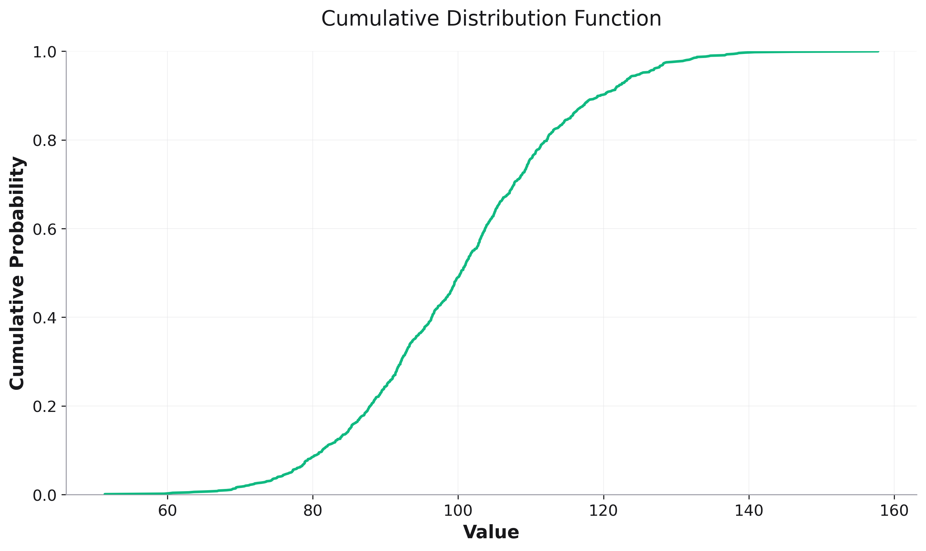
CDF Plots
Cumulative Distribution Function (CDF) plots are powerful tools for understanding data distributions and comparing multiple datasets. They show the probability that a variable takes a value less than or equal to a given value.
Basic CDF Plot
import rekha as rk
import pandas as pd
import numpy as np

# Generate sample data
data = np.random.normal(100, 15, 1000)
df = pd.DataFrame({'values': data})

fig = rk.cdf(df, x='values',
             title='Cumulative Distribution Function',
             labels={'values': 'Value', 'y': 'Cumulative Probability'})
fig.show()
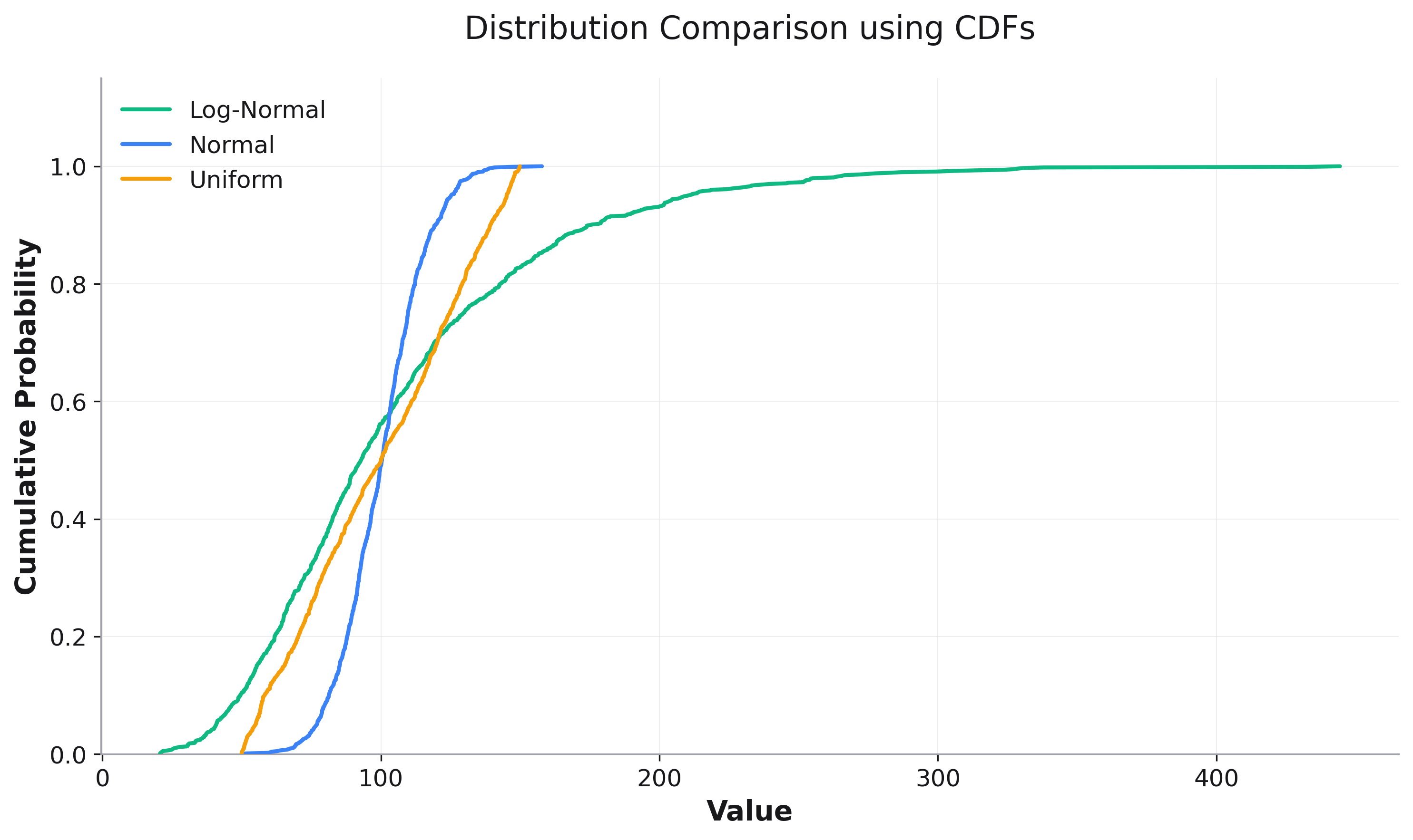
Comparing Distributions
CDFs are particularly useful for comparing multiple distributions:
# Compare different distributions
df = pd.DataFrame({
    'value': np.concatenate([
        np.random.normal(100, 15, 1000),      # Normal
        np.random.lognormal(4.5, 0.5, 1000),  # Log-Normal
        np.random.uniform(50, 150, 1000)      # Uniform
    ]),
    'distribution': ['Normal'] * 1000 + ['Log-Normal'] * 1000 + ['Uniform'] * 1000
})

fig = rk.cdf(df, x='value', color='distribution',
             title='Distribution Comparison using CDFs',
             labels={'value': 'Value', 'y': 'Cumulative Probability'})
fig.show()
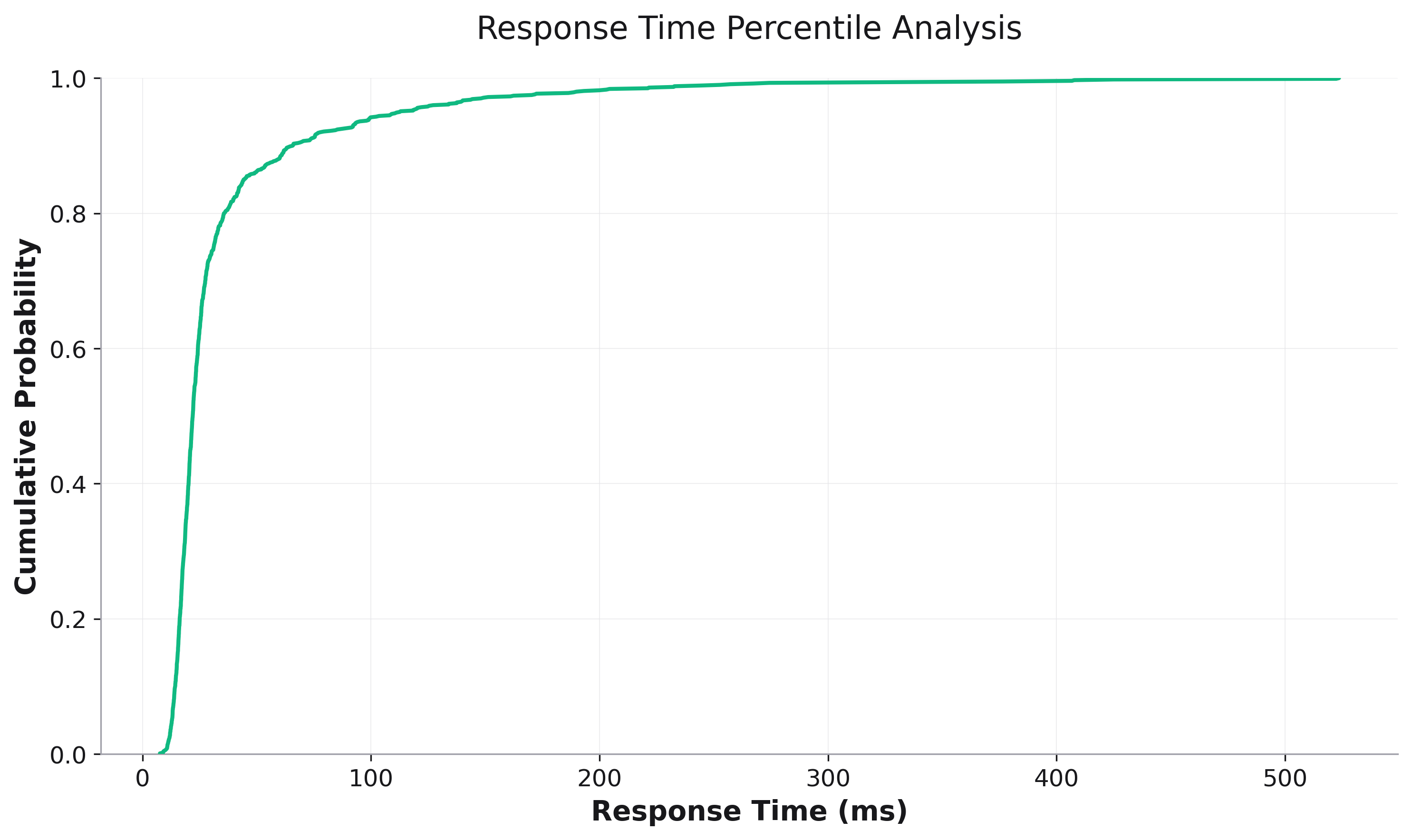
Percentile Analysis
CDFs are excellent for percentile analysis, especially for performance metrics:
# Response time analysis
response_times = np.concatenate([
    np.random.lognormal(3.0, 0.3, 800),  # Fast responses
    np.random.lognormal(4.0, 0.5, 150),  # Medium responses
    np.random.lognormal(5.0, 0.7, 50),   # Slow responses
])

df = pd.DataFrame({'response_time_ms': response_times})

fig = rk.cdf(df, x='response_time_ms',
             title='Response Time Percentile Analysis',
             labels={'response_time_ms': 'Response Time (ms)',
                    'y': 'Percentile'})

# Add percentile markers
ax = fig.get_axes()[0]
for p in [50, 90, 95, 99]:
    value = np.percentile(response_times, p)
    ax.axhline(y=p/100, color='red', linestyle='--', alpha=0.3)
    ax.axvline(x=value, color='red', linestyle='--', alpha=0.3)
    ax.text(value, p/100, f'P{p}: {value:.0f}ms',
            fontsize=8, ha='left', va='bottom')

fig.show()
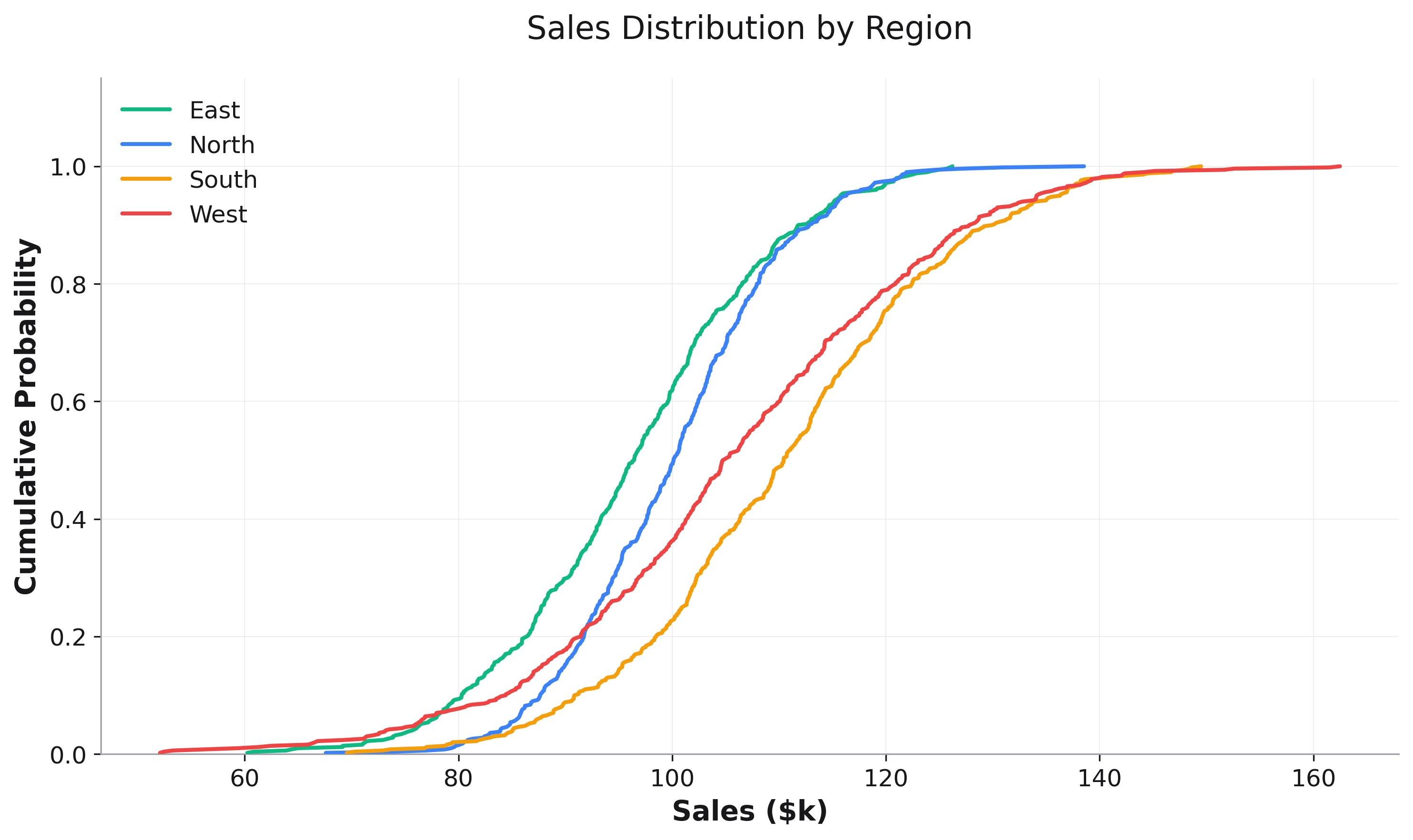
Grouped CDFs
Compare distributions across different groups:
# Create sample sales data
sales_df = pd.DataFrame({
    'sales': np.random.exponential(50, 1000),
    'region': np.random.choice(['North', 'South', 'East', 'West'], 1000)
})

# Sales distribution by region
fig = rk.cdf(sales_df, x='sales', color='region',
             title='Sales Distribution by Region',
             labels={'sales': 'Sales ($k)', 'y': 'Cumulative Probability'})
fig.show()
Customization Options
Custom Colors
fig = rk.cdf(df, x='value', color='category',
             color_mapping={
                 'A': '#FF6B6B',
                 'B': '#4ECDC4',
                 'C': '#45B7D1'
             })
Parameters
See the API Reference for complete parameter documentation.