Box Plots
Box plots are ideal for statistical summaries, outlier detection, and comparing distributions across groups. Rekha’s box plots show quartiles, medians, and outliers with clean, informative visualizations.
Basic Usage
import rekha as rk
import pandas as pd
import numpy as np

# Simple box plot
data = np.random.normal(50, 15, 1000)
df = pd.DataFrame({'values': data})

fig = rk.box(df, y='values', title='Value Distribution')
fig.show()
Examples Gallery
Basic Box Plot
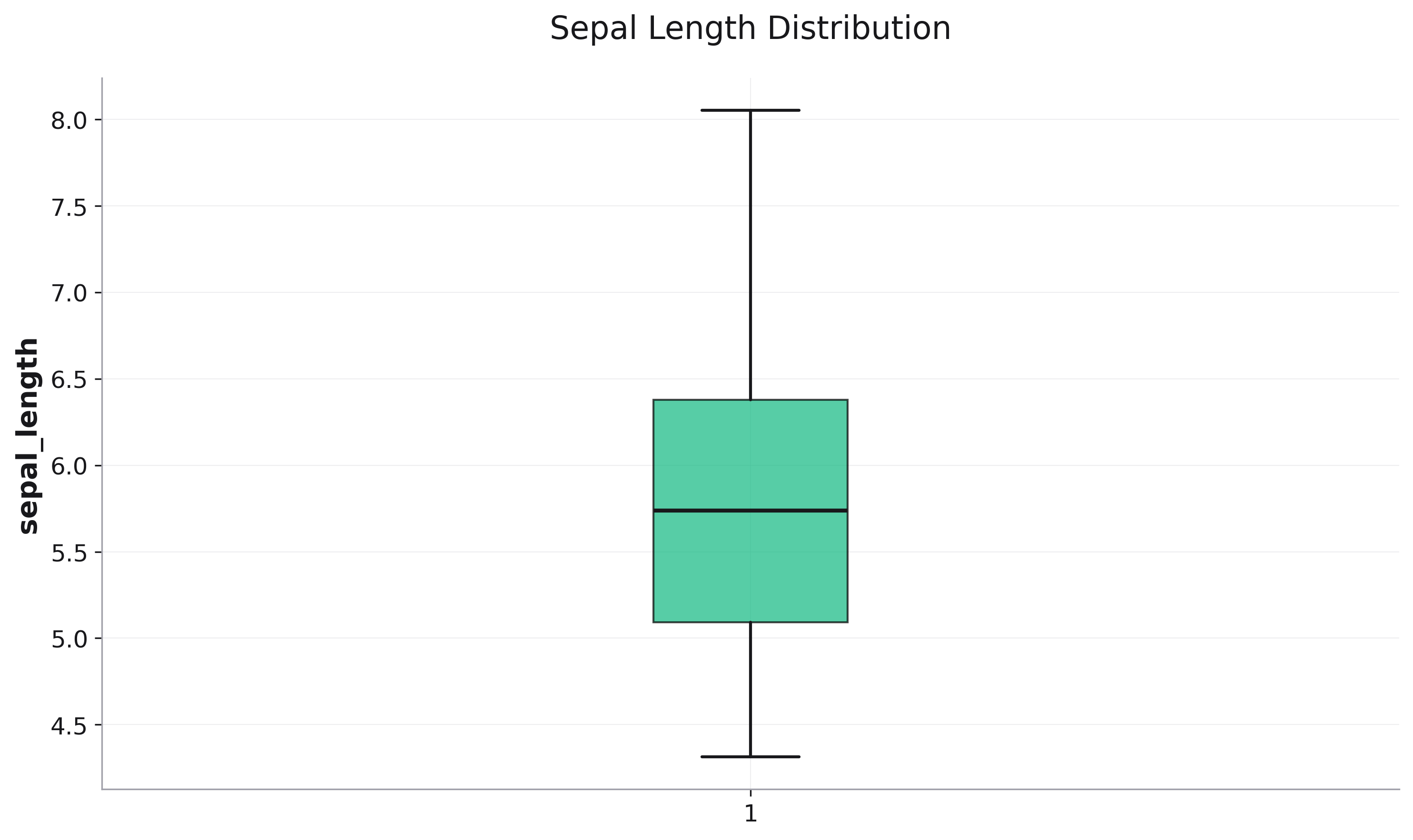
Single variable distribution summary:
import rekha as rk
from examples.utils import get_iris

df = get_iris()

fig = rk.box(
    data=df,
    y='sepal_length',
    title='Sepal Length Distribution'
)
Grouped Box Plot
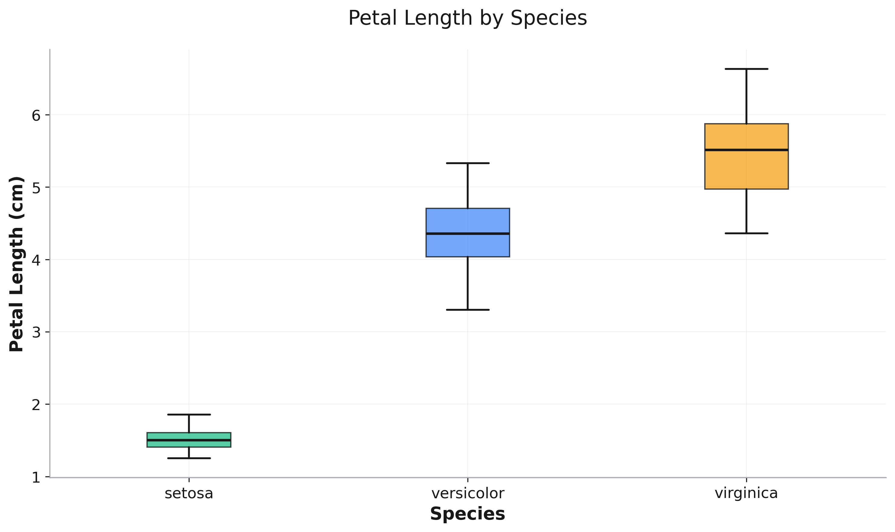
Compare distributions across categories:
fig = rk.box(
    data=df,
    x='species',
    y='petal_length',
    title='Petal Length by Species',
    labels={'species': 'Species', 'petal_length': 'Petal Length (cm)'}
)
Parameters
See the API Reference for complete parameter documentation.
What Box Plots Show
Box: Interquartile range (25th to 75th percentile)
Line in box: Median (50th percentile)
Whiskers: Extend to 1.5 × IQR from box edges
Points: Outliers beyond whiskers
See Also
Histograms - For detailed distribution shapes
Scatter Plots - For relationship exploration
API Reference - Complete parameter documentation