Heatmaps
Heatmaps are perfect for visualizing 2D data, correlation matrices, confusion matrices, and pivot tables. Rekha’s heatmaps offer intuitive color mapping, text annotations, and customizable color scales.
Basic Usage
import rekha as rk
import pandas as pd
import numpy as np

# Simple correlation heatmap
df = pd.DataFrame(np.random.randn(50, 4), columns=['A', 'B', 'C', 'D'])
correlation_matrix = df.corr()

fig = rk.heatmap(correlation_matrix, title='Correlation Matrix', text_auto=True)
fig.show()
Examples Gallery
Correlation Matrix
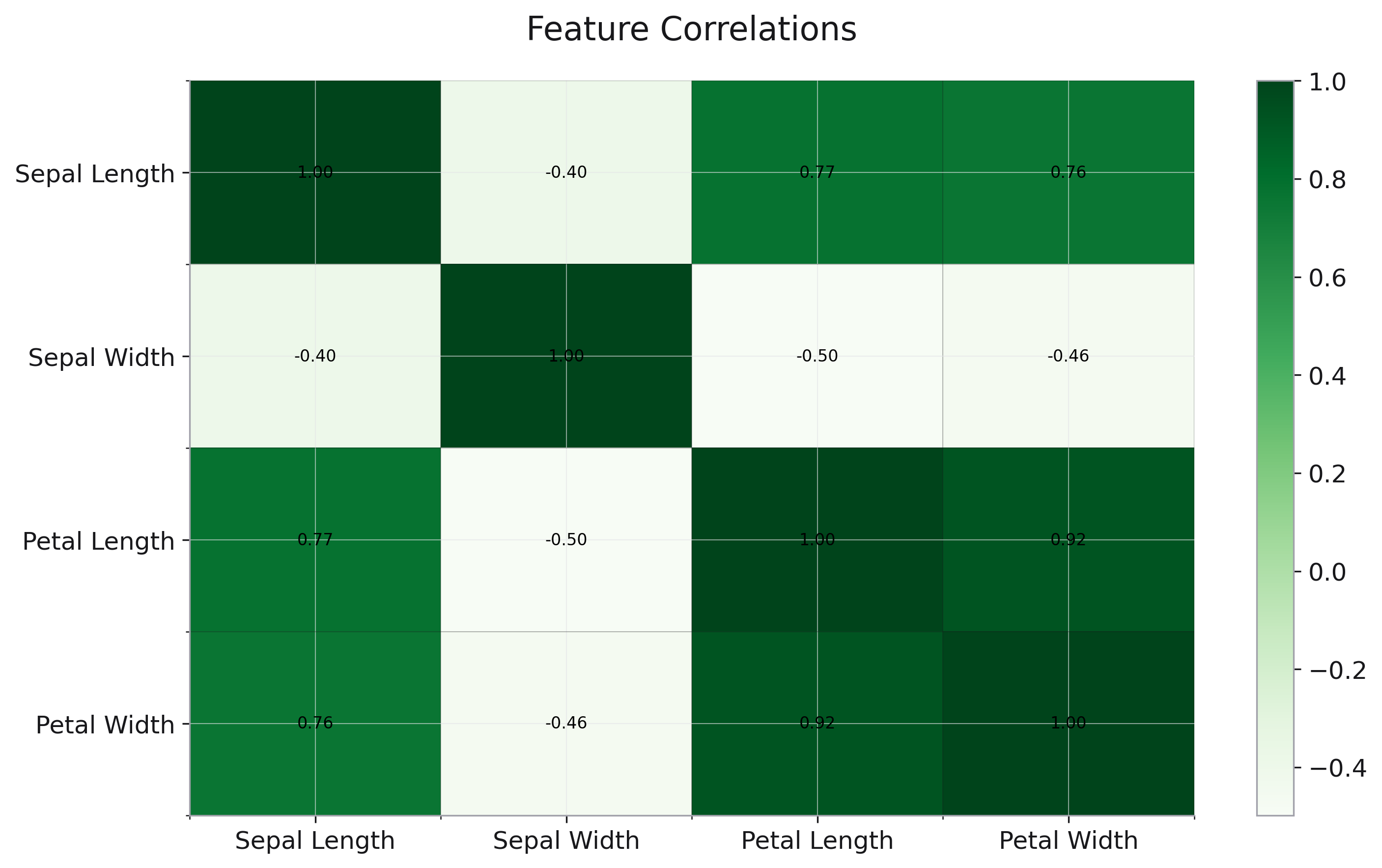
Feature correlation analysis:
import rekha as rk
from examples.utils import get_iris, get_tips

df = get_iris()
numeric_cols = ['sepal_length', 'sepal_width', 'petal_length', 'petal_width']
correlation_matrix = df[numeric_cols].corr()

# Pretty column names
correlation_matrix.index = ['Sepal Length', 'Sepal Width', 'Petal Length', 'Petal Width']
correlation_matrix.columns = ['Sepal Length', 'Sepal Width', 'Petal Length', 'Petal Width']

fig = rk.heatmap(
    data=correlation_matrix,
    title='Feature Correlations',
    text_auto=True
)
Pivot Table Visualization

Visualize pivot table data:
df_tips = get_tips()
pivot_table = df_tips.pivot_table(
    values='tip',
    index='day',
    columns='time',
    aggfunc='mean'
)

fig = rk.heatmap(
    data=pivot_table,
    title='Average Tip by Day and Time',
    text_auto=True
)
Parameters
See the API Reference for complete parameter documentation.
See Also
Bar Plots - For categorical comparisons
Scatter Plots - For relationship exploration
API Reference - Complete parameter documentation