Color Palettes
Choose from professional color palettes designed for different contexts and data types.
Available Palettes
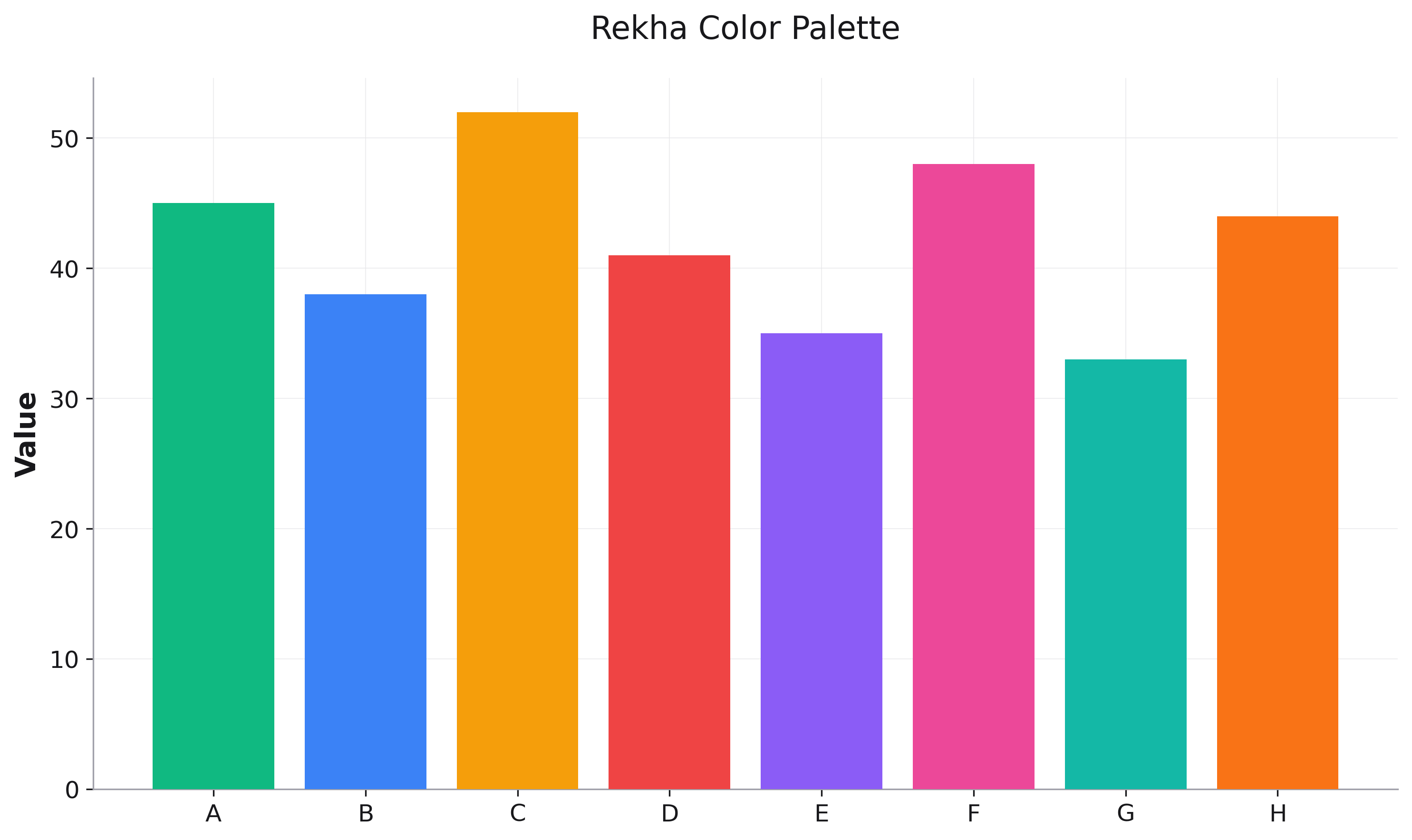
Rekha (Default)
A vibrant, balanced palette suitable for most visualizations.
fig = rk.bar(df, x='category', y='value',
             palette='rekha')  # This is the default
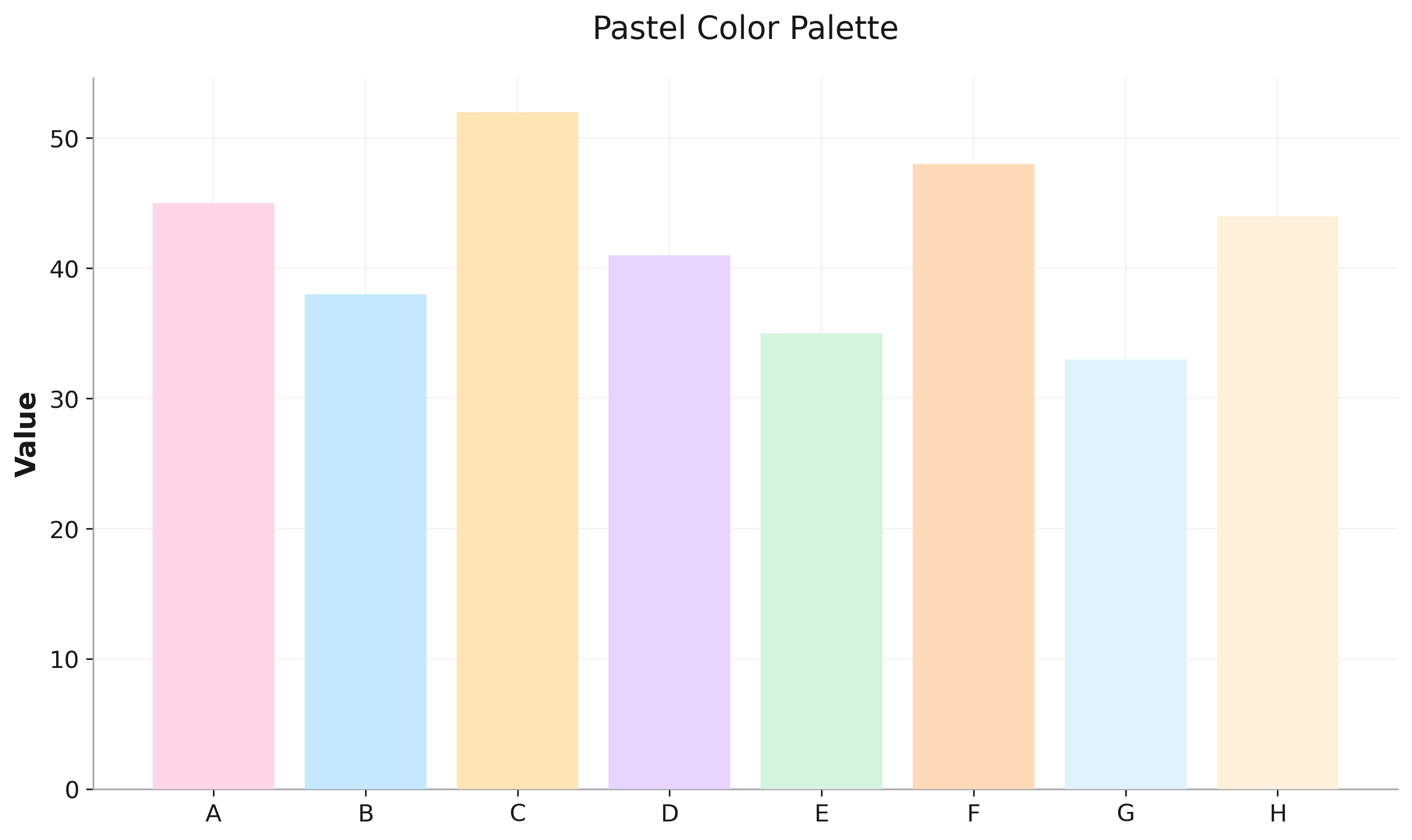
Pastel
Soft, muted colors ideal for presentations and reports.
fig = rk.scatter(df, x='x', y='y', color='category',
                 palette='pastel')
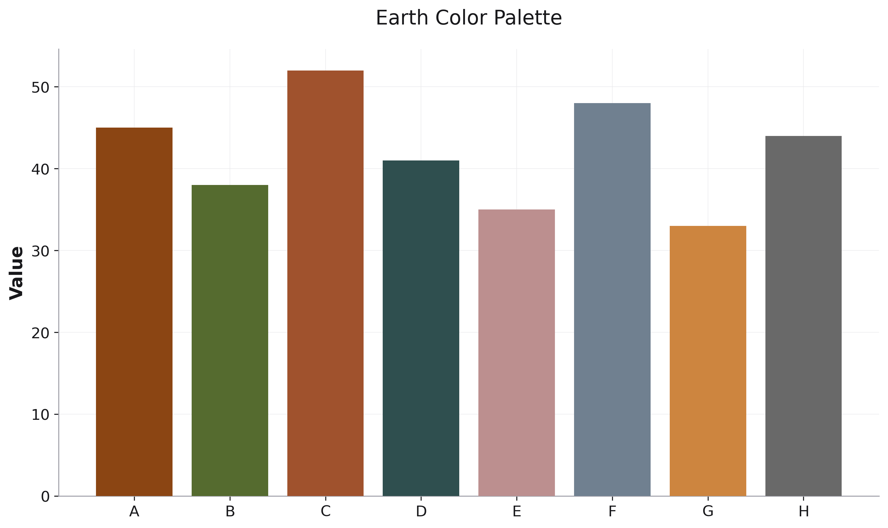
Earth
Natural, earthy tones perfect for environmental or organic data.
fig = rk.line(df, x='year', y='temperature', color='region',
              palette='earth')
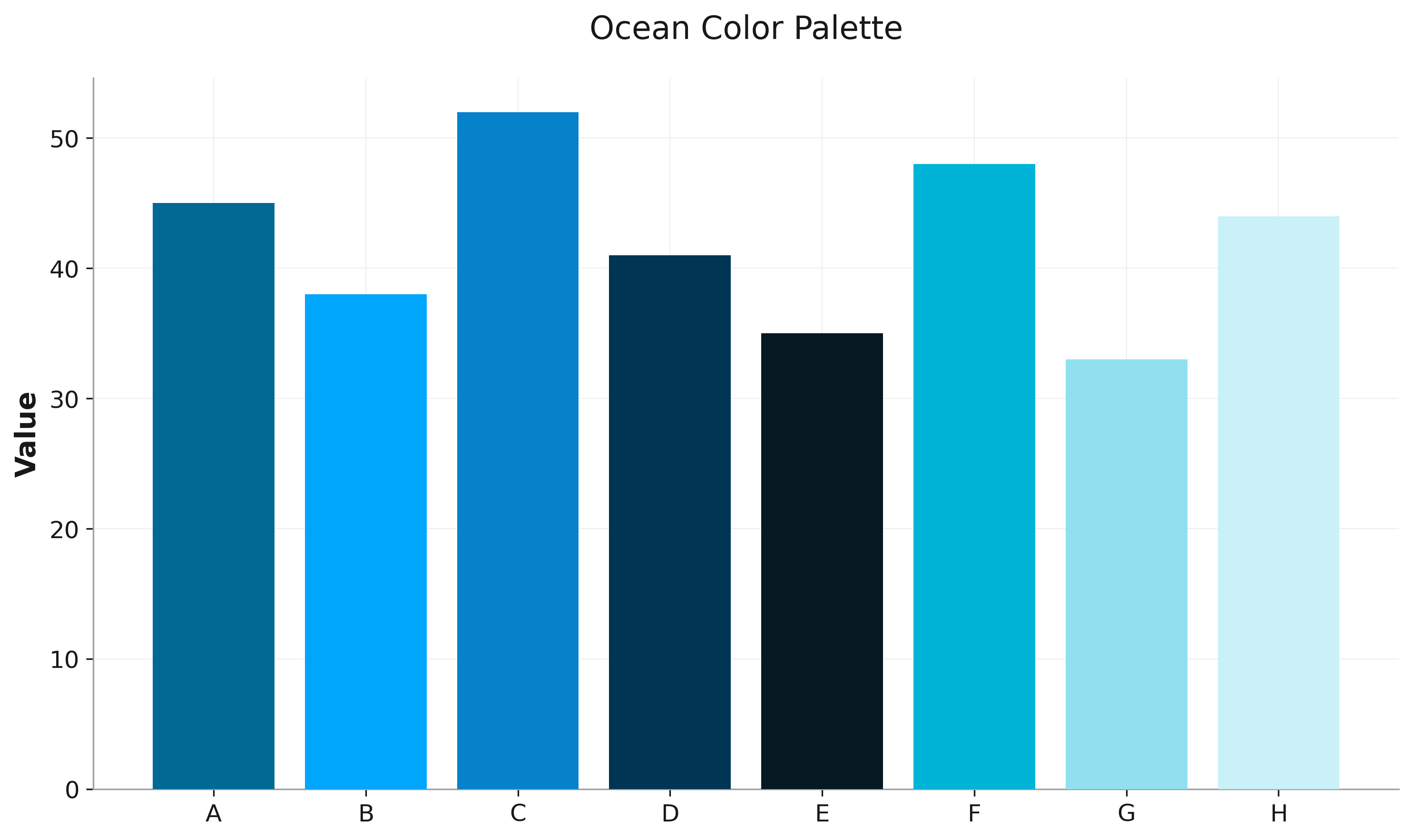
Ocean
Blues and aquatic colors for marine or water-related data.
fig = rk.bar(df, x='depth', y='pressure',
             palette='ocean')
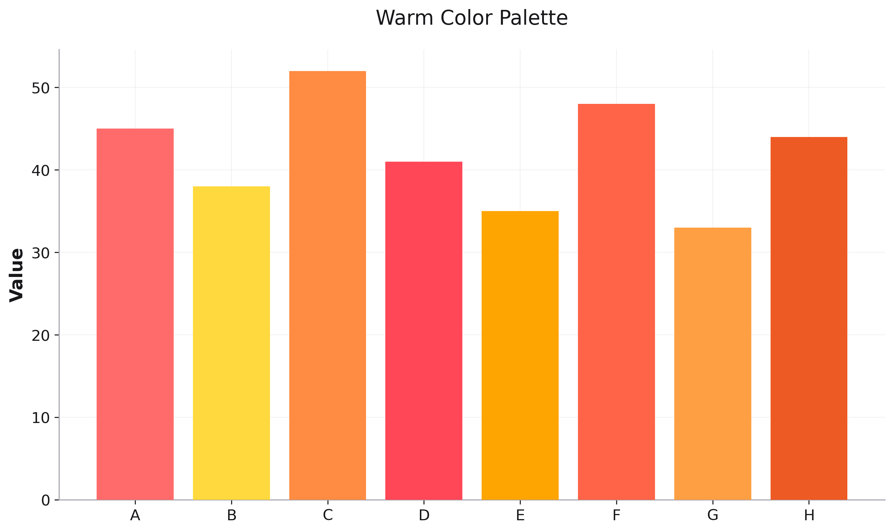
Warm
Reds, oranges, and yellows for heat-related or energetic visualizations.
fig = rk.heatmap(correlation_matrix,
                 palette='warm')
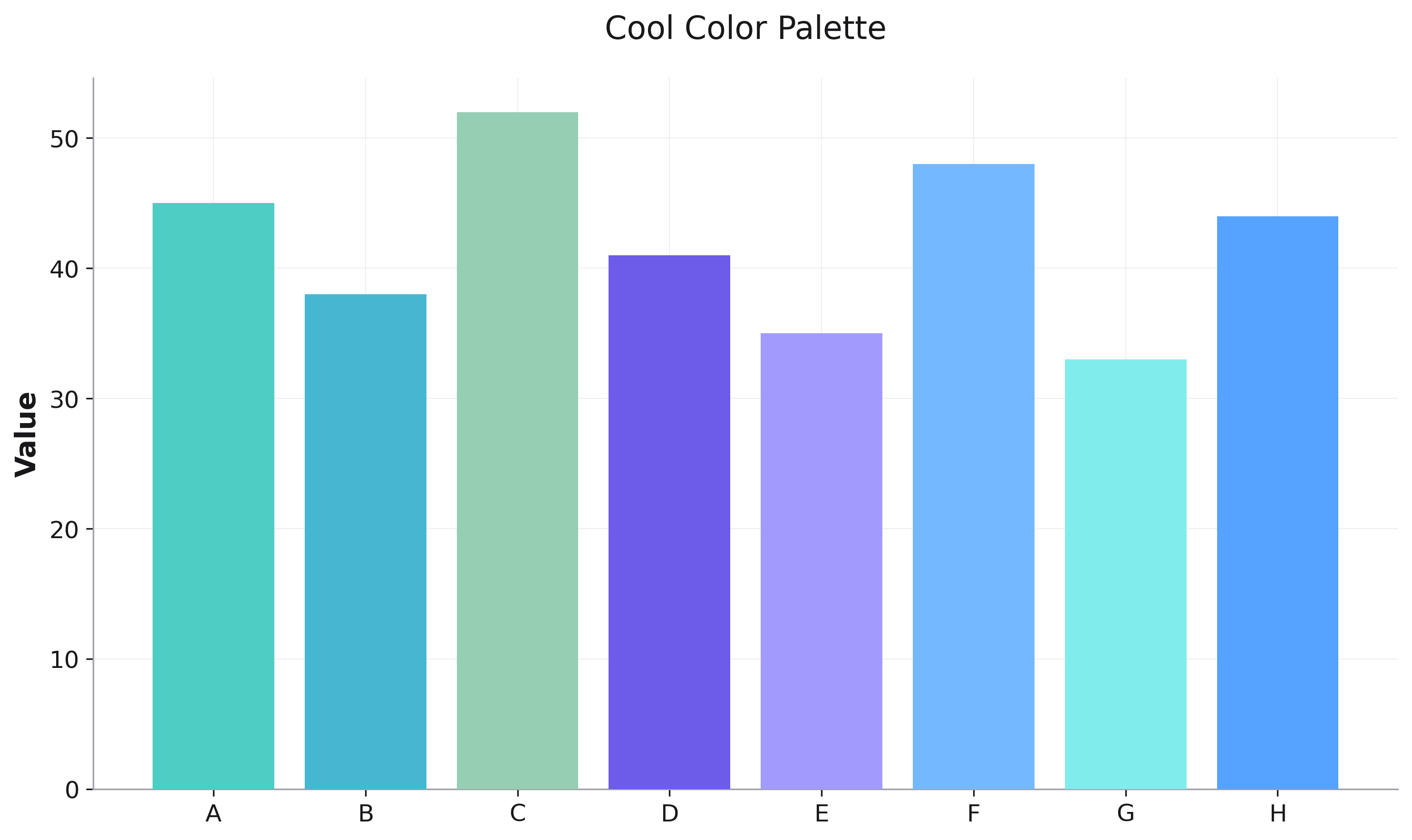
Cool
Blues, greens, and purples for calm, professional visualizations.
fig = rk.scatter(df, x='x', y='y', color='group',
                 palette='cool')
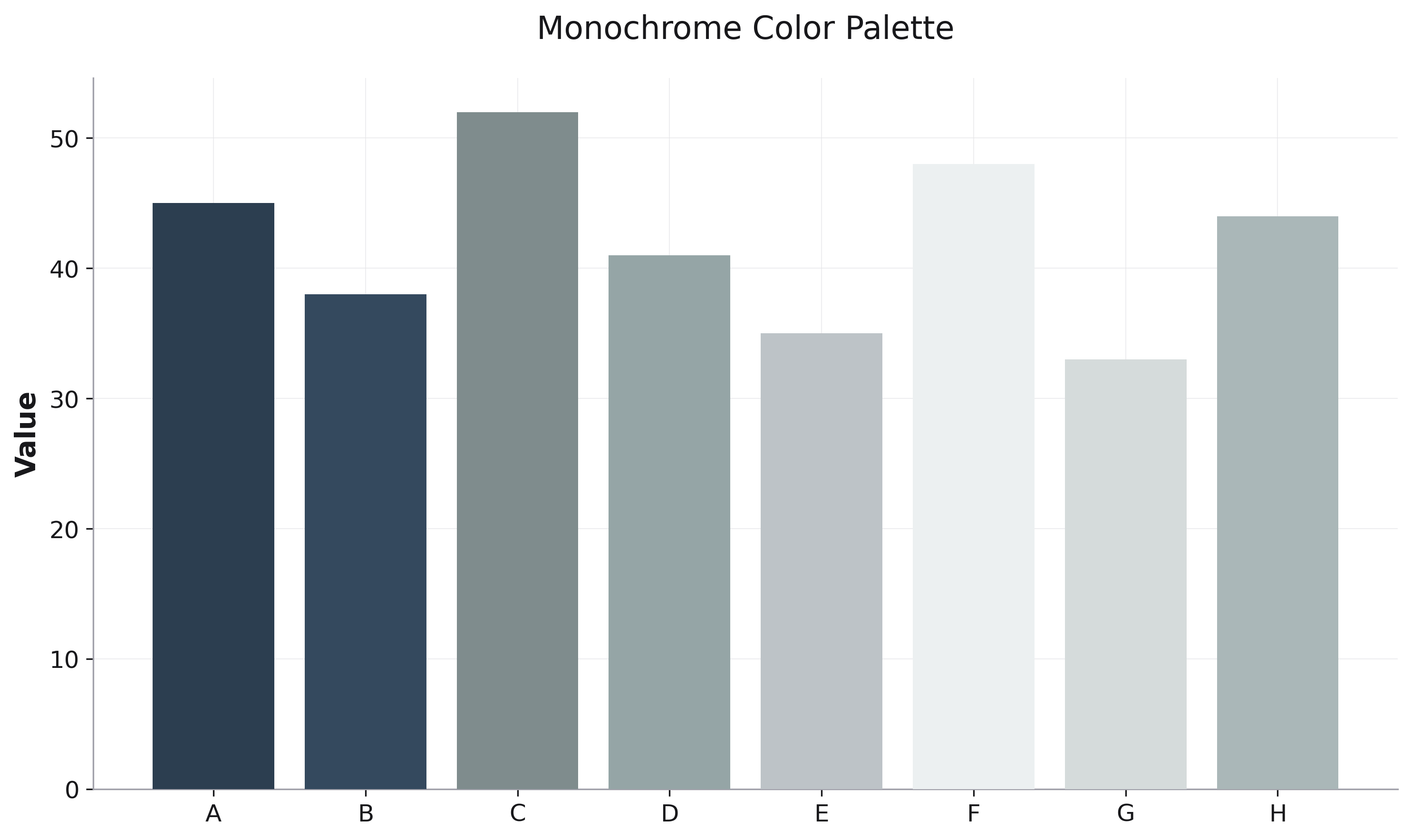
Monochrome
Grayscale variations for grayscale printing or minimalist design.
fig = rk.bar(df, x='category', y='value', color='type',
             palette='monochrome')
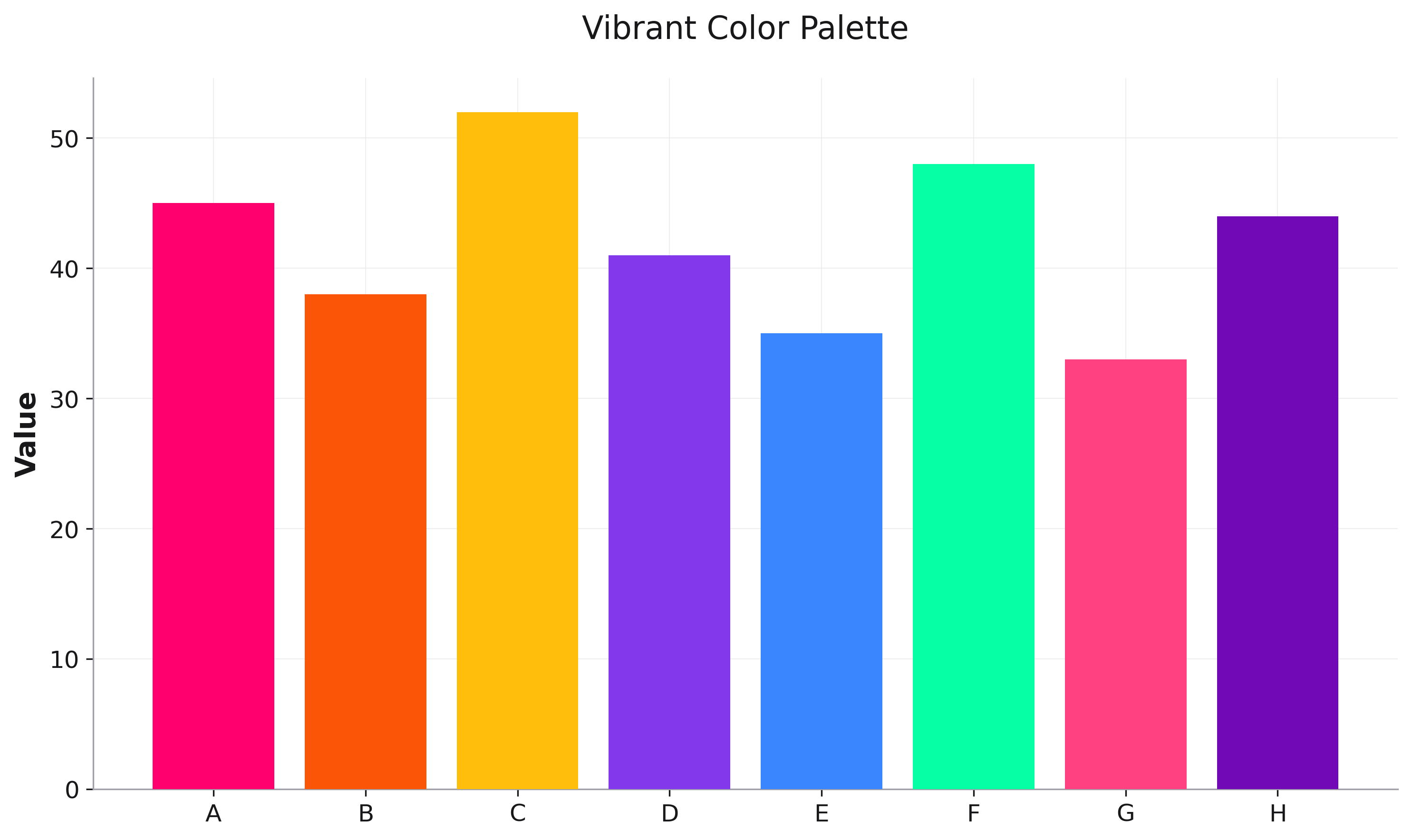
Vibrant
High-contrast, bright colors for maximum visual impact.
fig = rk.scatter(df, x='x', y='y', color='cluster',
                 palette='vibrant')
Code Editor Palettes
Popular editor themes adapted for data visualization.
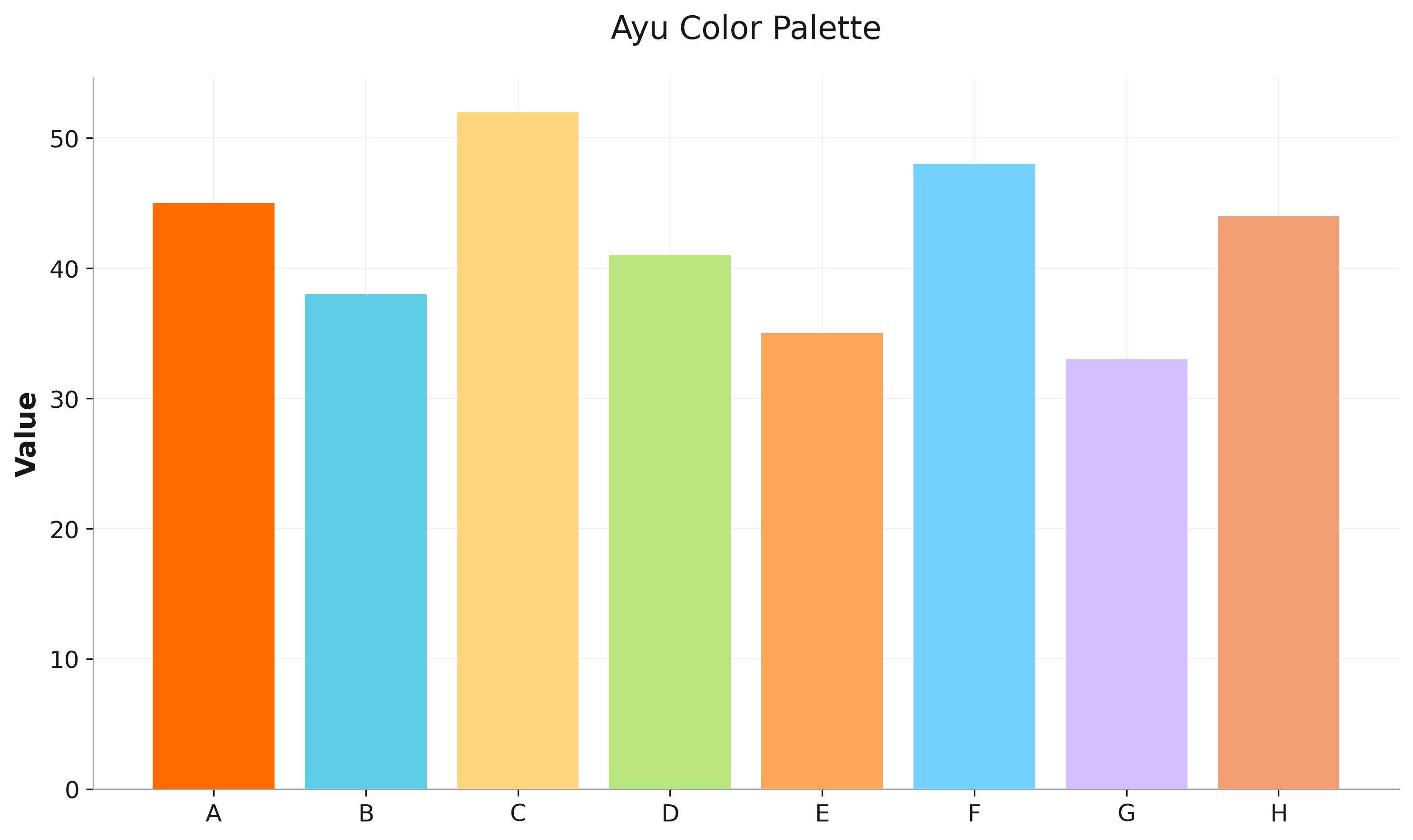
Ayu
Warm and vibrant colors from the Ayu theme.
fig = rk.bar(df, x='category', y='value', color='type',
             palette='ayu')
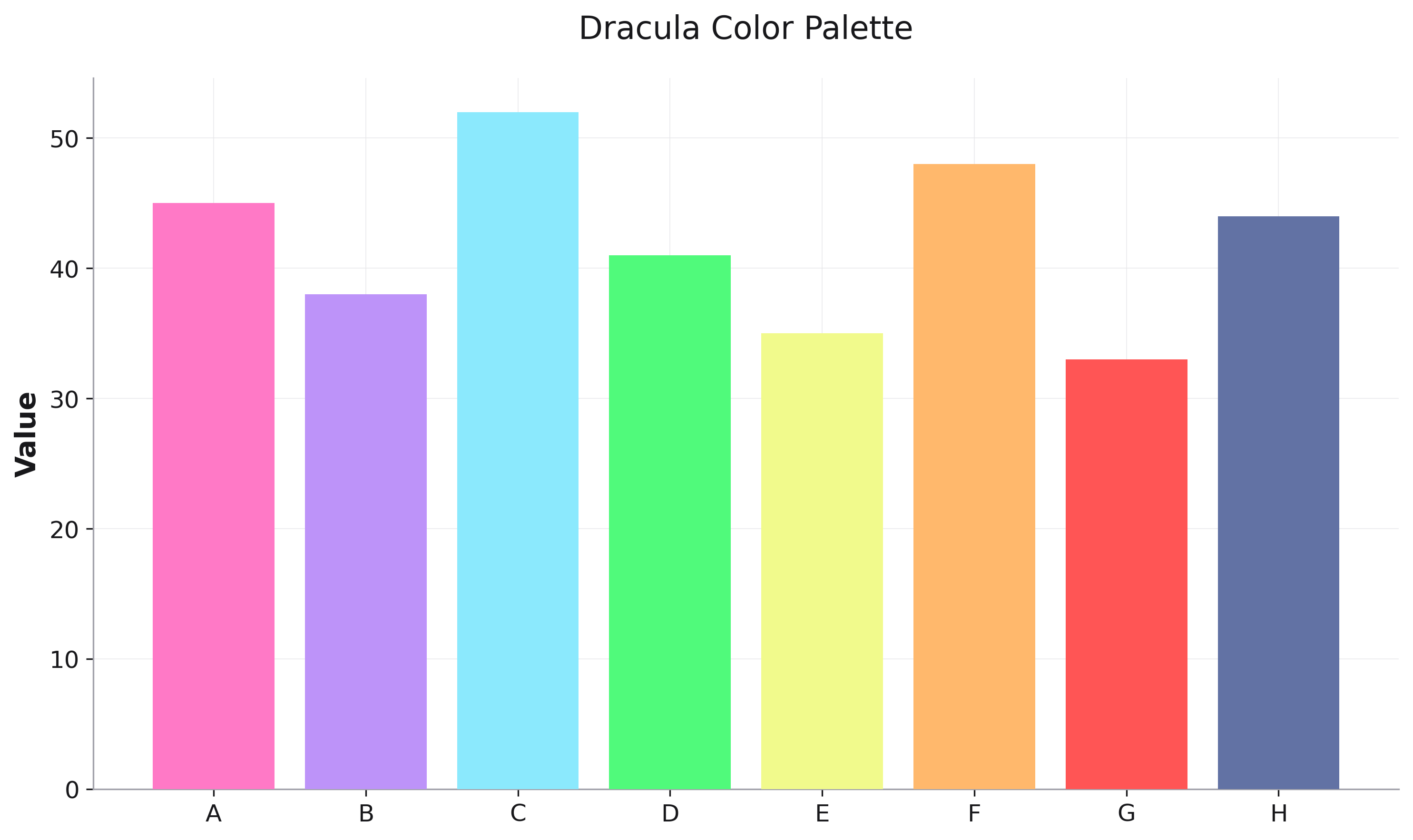
Dracula
Dark theme with vibrant accents.
fig = rk.scatter(df, x='x', y='y', color='category',
                 palette='dracula')
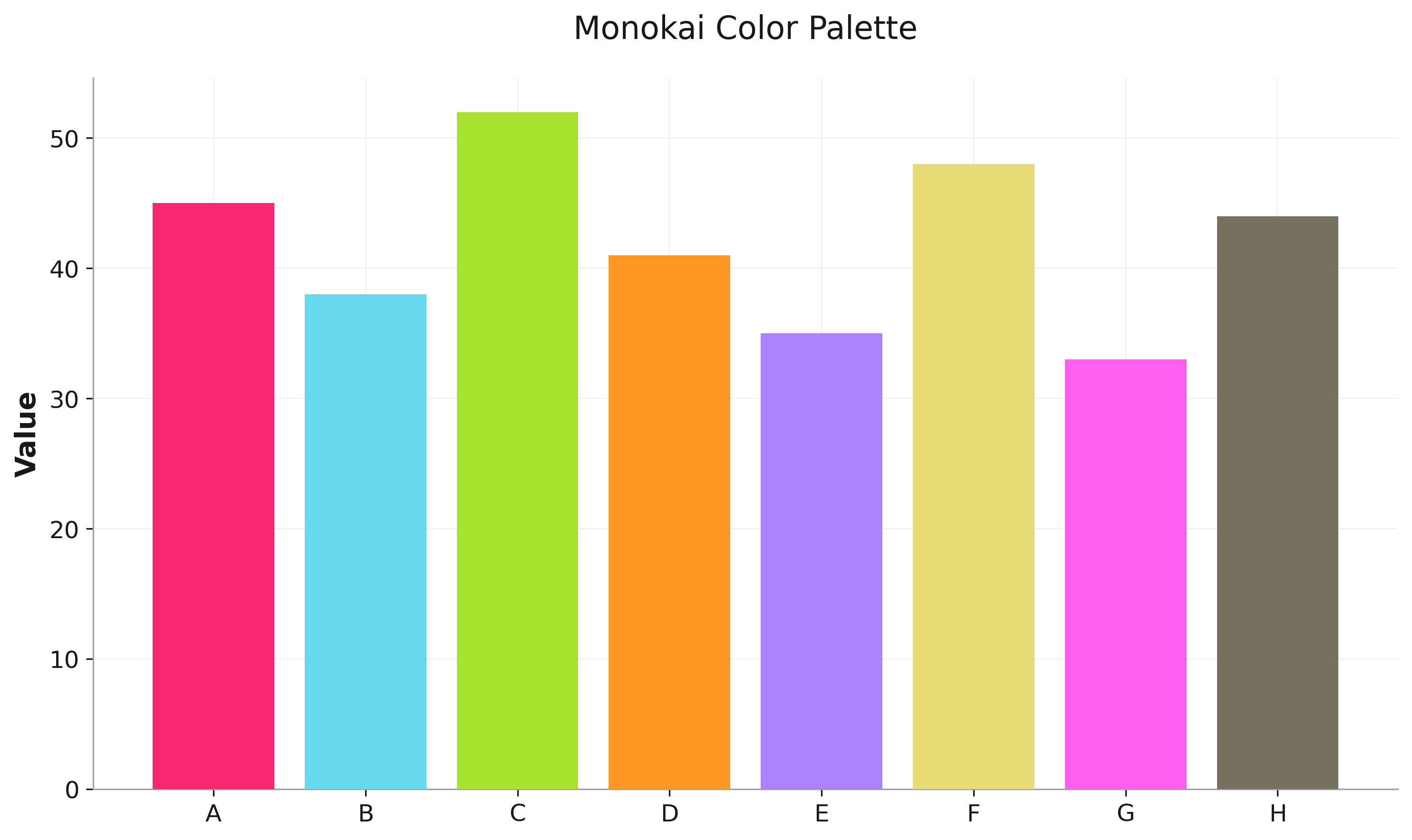
Monokai
Classic syntax highlighting colors.
fig = rk.line(df, x='time', y='value', color='series',
              palette='monokai')
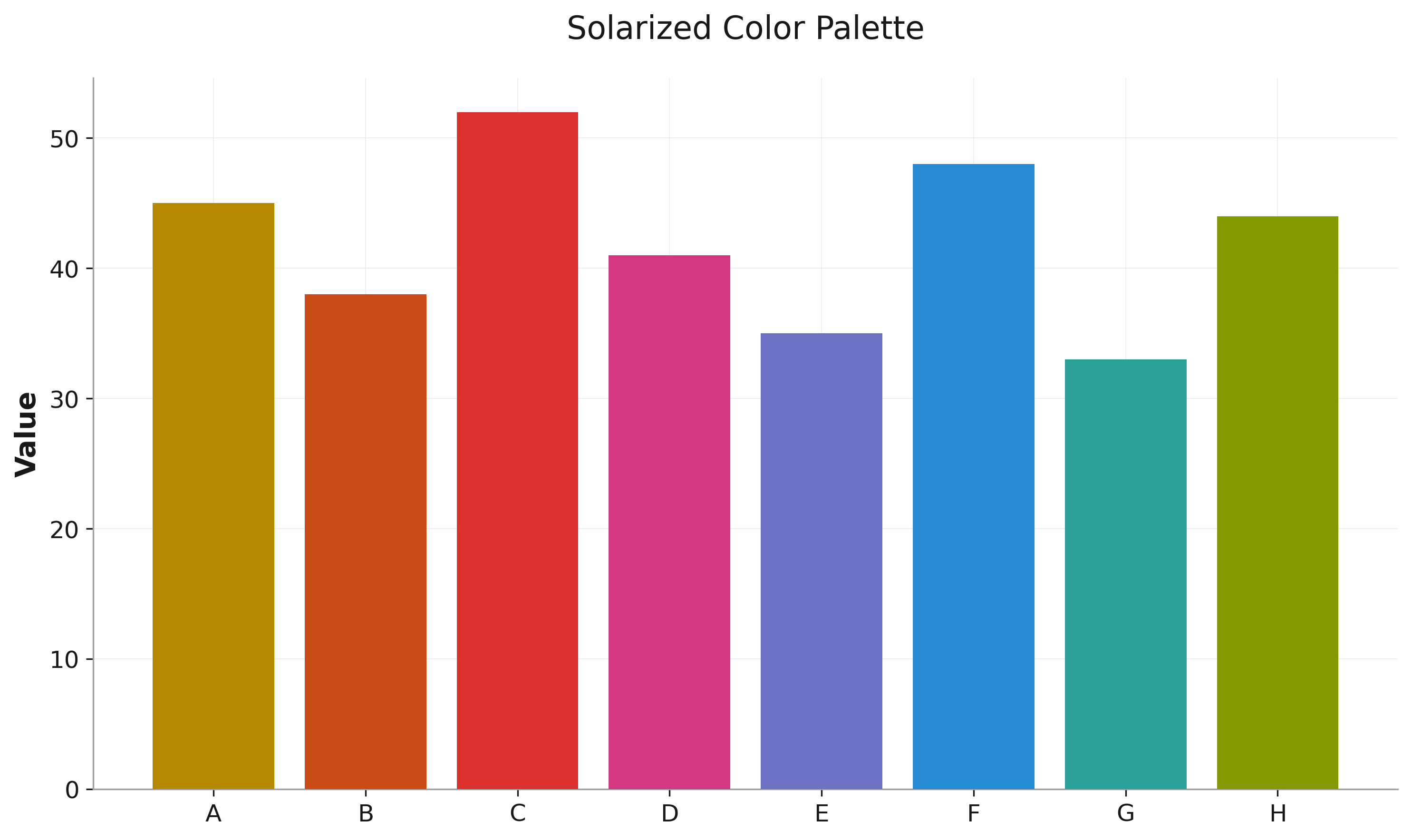
Solarized
Carefully chosen colors with precise contrast ratios.
fig = rk.bar(df, x='month', y='sales', color='product',
             palette='solarized')
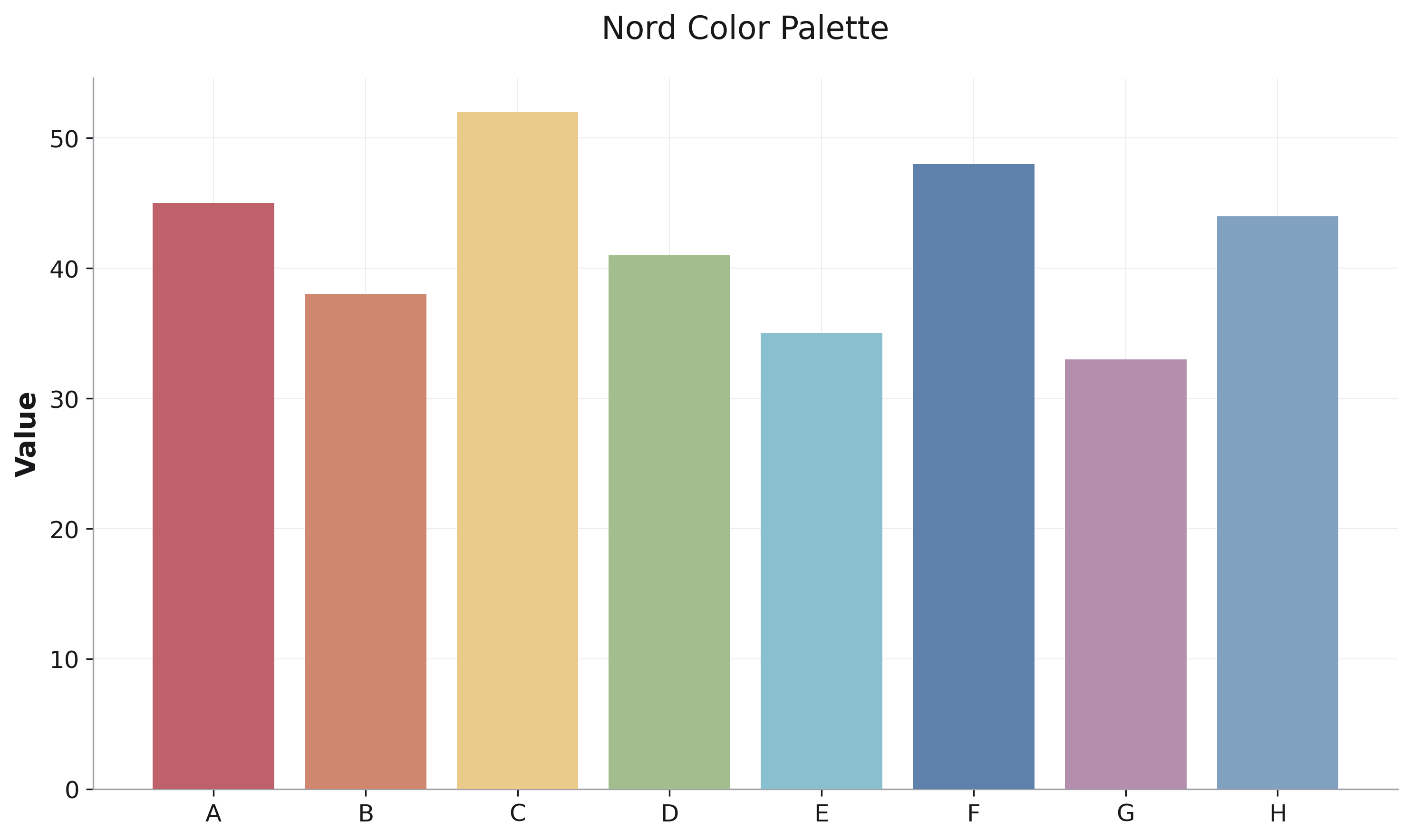
Nord
Arctic, north-bluish color palette.
fig = rk.scatter(df, x='x', y='y', color='group',
                 palette='nord')
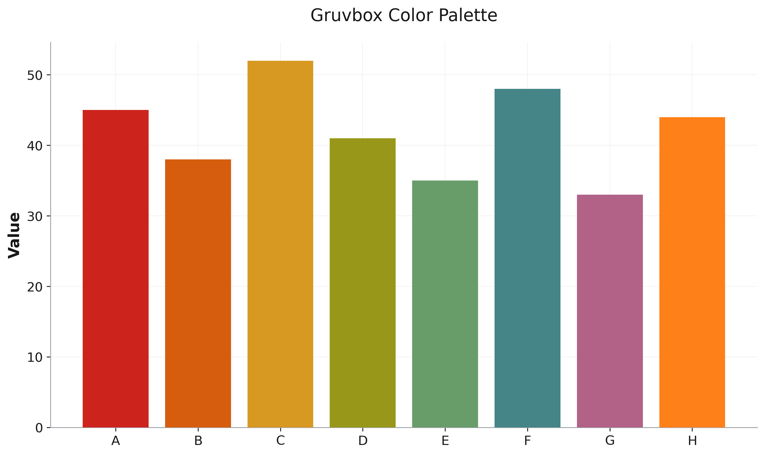
Gruvbox
Retro groove colors with warm hues.
fig = rk.line(df, x='date', y='metric', color='category',
              palette='gruvbox')
Usage
# Specify palette parameter
fig = rk.bar(df, x='month', y='sales', color='product',
             palette='ocean')

# Works with dark mode
fig = rk.line(df, x='time', y='value', color='series',
              palette='cool',
              dark_mode=True)

# Override specific colors
fig = rk.scatter(df, x='x', y='y', color='category',
                 palette='earth',
                 color_mapping={'Special': '#FF0000'})

# Combine with grayscale patterns
fig = rk.bar(df, x='category', y='value', color='type',
             palette='cool',
             grayscale_friendly=True)